Chapter 7 Marker gene detection
7.1 Motivation
Now that we’ve got a clustering from Chapter 6, our next step is to identify the genes that drive separation between clusters. Genes that are strongly upregulated in a particular cluster are called “markers” as they define the corresponding cell type/state relative to other cells in the population. By examining the annotated functions of the marker genes, we can assign biological meaning to each cluster. In the simplest case, if we know that certain genes are upregulated in a particular cell type, a cluster with increased expression of those genes can be treated as a proxy for that cell type. More subtle cell states (e.g., activation status, stress) can also be identified based on the behavior of genes in the affected pathways.
7.2 Scoring marker genes
7.2.1 Comparing pairs of clusters
Our general strategy is to test for differential expression (DE) between clusters and examine the top DE genes from each comparison. Specifically, we quantify the DE between each pair of clusters by computing an effect size for each gene (Section 7.2.2). We then summarize the effect sizes across comparisons for each cluster into a single statistic per gene (Section 7.2.3). Sorting on one of the effect size summaries yields a ranking of potential marker genes for each cluster. To illustrate, let’s load our old friend, the PBMC dataset from 10X Genomics (Zheng et al. 2017).
# Loading in raw data from the 10X output files.
library(DropletTestFiles)
raw.path.10x <- getTestFile("tenx-2.1.0-pbmc4k/1.0.0/filtered.tar.gz")
dir.path.10x <- file.path(tempdir(), "pbmc4k")
untar(raw.path.10x, exdir=dir.path.10x)

library(DropletUtils)
fname.10x <- file.path(dir.path.10x, "filtered_gene_bc_matrices/GRCh38")
sce.10x <- read10xCounts(fname.10x, col.names=TRUE)

# Applying our default QC with outlier-based thresholds.
library(scrapper)
is.mito.10x <- grepl("^MT-", rowData(sce.10x)$Symbol)
sce.qc.10x <- quickRnaQc.se(sce.10x, subsets=list(MT=is.mito.10x))
sce.qc.10x <- sce.qc.10x[,sce.qc.10x$keep]

# Computing log-normalized expression values.
sce.norm.10x <- normalizeRnaCounts.se(sce.qc.10x, size.factors=sce.qc.10x$sum)

# We now choose the top HVGs.
sce.var.10x <- chooseRnaHvgs.se(sce.norm.10x, more.choose.args=list(top=4000))

# Running the PCA on the HVG submatrix.
sce.pca.10x <- runPca.se(sce.var.10x, features=rowData(sce.var.10x)$hvg, number=25)

# Doing some graph-based clustering, t-SNEs, etc.
sce.nn.10x <- runAllNeighborSteps.se(sce.pca.10x)
sce.nn.10x
## class: SingleCellExperiment
## dim: 33694 4147
## metadata(3): Samples qc PCA
## assays(2): counts logcounts
## rownames(33694): ENSG00000243485 ENSG00000237613 ... ENSG00000277475
## ENSG00000268674
## rowData names(7): ID Symbol ... residuals hvg
## colnames(4147): AAACCTGAGACAGACC-1 AAACCTGAGCGCCTCA-1 ...
## TTTGTCAGTTAAGACA-1 TTTGTCATCCCAAGAT-1
## colData names(8): Sample Barcode ... sizeFactor clusters
## reducedDimNames(3): PCA TSNE UMAP
## mainExpName: NULL
## altExpNames(0):Given the clustering and the log-expression values, the scoreMarkers.se() function returns a data frame of marker statistics for each cluster.
Each data frame contains the mean log-expression and the proportion of cells with detected (i.e., non-zero) expression in a particular cluster.
It also contains multiple columns representing effect size summaries, where each column is named as <effect size>.<summary type>,
e.g., cohens.d.mean contains the mean of the Cohen’s \(d\) across all comparisons involving that cluster.
Genes with larger cohens.d.mean values exhibit stronger upregulation in the current cluster compared to the average of the other clusters.
By default, scoreMarkers.se() orders the rows on cohens.d.mean, which represents one possible ranking of markers for each cluster.
markers.10x <- scoreMarkers.se(sce.nn.10x, sce.nn.10x$clusters, extra.columns="Symbol")
names(markers.10x)
## [1] "1" "2" "3" "4" "5" "6" "7" "8" "9" "10" "11"# Examining the statistics for cluster 1.
chosen.cluster <- "1"
chosen.markers.10x <- markers.10x[[chosen.cluster]]
head(chosen.markers.10x)## DataFrame with 6 rows and 23 columns
## Symbol mean detected cohens.d.min cohens.d.mean
## <character> <numeric> <numeric> <numeric> <numeric>
## ENSG00000090382 LYZ 5.80862 0.998729 0.8145154 6.63007
## ENSG00000087086 FTL 6.24421 1.000000 -0.3996035 4.98157
## ENSG00000011600 TYROBP 4.05728 0.997459 0.4176424 4.65609
## ENSG00000163220 S100A9 5.63461 0.996188 2.1347048 4.56463
## ENSG00000143546 S100A8 5.37071 1.000000 2.4422557 4.30814
## ENSG00000163131 CTSS 3.81179 0.997459 -0.0492655 3.88013
## cohens.d.median cohens.d.max cohens.d.min.rank auc.min
## <numeric> <numeric> <integer> <numeric>
## ENSG00000090382 7.52540 8.84770 1 0.760525
## ENSG00000087086 5.59914 7.23427 1 0.406228
## ENSG00000011600 6.13868 7.15137 2 0.639057
## ENSG00000163220 4.98685 5.33239 2 0.927441
## ENSG00000143546 4.61885 4.73656 1 0.944957
## ENSG00000163131 4.11857 5.45536 2 0.494780
## auc.mean auc.median auc.max auc.min.rank delta.mean.min
## <numeric> <numeric> <numeric> <integer> <numeric>
## ENSG00000090382 0.973853 0.998880 0.998974 1 0.8230802
## ENSG00000087086 0.940033 0.999995 1.000000 1 -0.1740122
## ENSG00000011600 0.941867 0.997856 0.998416 3 0.2037323
## ENSG00000163220 0.988210 0.996637 0.996751 3 3.0134895
## ENSG00000143546 0.990912 0.997315 0.997937 2 3.3958255
## ENSG00000163131 0.944007 0.995314 0.997834 2 -0.0269158
## delta.mean.mean delta.mean.median delta.mean.max
## <numeric> <numeric> <numeric>
## ENSG00000090382 4.47263 5.12259 5.24414
## ENSG00000087086 2.67120 3.09281 3.28471
## ENSG00000011600 2.65311 3.68333 3.78321
## ENSG00000163220 4.48435 4.80883 4.85246
## ENSG00000143546 4.50586 4.71901 4.77685
## ENSG00000163131 2.58808 2.89583 3.34762
## delta.mean.min.rank delta.detected.min delta.detected.mean
## <integer> <numeric> <numeric>
## ENSG00000090382 1 -0.00127065 0.38767601
## ENSG00000087086 4 0.00000000 0.00365274
## ENSG00000011600 4 -0.00254130 0.44956424
## ENSG00000163220 2 0.04063250 0.31324397
## ENSG00000143546 1 0.05925926 0.42422861
## ENSG00000163131 5 -0.00254130 0.34497914
## delta.detected.median delta.detected.max
## <numeric> <numeric>
## ENSG00000090382 0.47919580 0.586641
## ENSG00000087086 0.00102669 0.010989
## ENSG00000011600 0.71614818 0.755306
## ENSG00000163220 0.37554637 0.512672
## ENSG00000143546 0.51712877 0.604396
## ENSG00000163131 0.36907130 0.623682
## delta.detected.min.rank
## <integer>
## ENSG00000090382 43
## ENSG00000087086 33694
## ENSG00000011600 14
## ENSG00000163220 66
## ENSG00000143546 37
## ENSG00000163131 41# A more concise overview.
previewMarkers(chosen.markers.10x, pre.columns='Symbol')## DataFrame with 10 rows and 4 columns
## Symbol mean detected lfc
## <character> <numeric> <numeric> <numeric>
## ENSG00000090382 LYZ 5.80862 0.998729 4.47263
## ENSG00000087086 FTL 6.24421 1.000000 2.67120
## ENSG00000011600 TYROBP 4.05728 0.997459 2.65311
## ENSG00000163220 S100A9 5.63461 0.996188 4.48435
## ENSG00000143546 S100A8 5.37071 1.000000 4.50586
## ENSG00000163131 CTSS 3.81179 0.997459 2.58808
## ENSG00000101439 CST3 3.93963 0.998729 2.38272
## ENSG00000085265 FCN1 2.75854 0.970775 2.36554
## ENSG00000204482 LST1 2.90740 0.988564 2.05035
## ENSG00000197956 S100A6 4.49784 0.998729 2.28517We examine the top genes for some annotated biological function or cell type specificity that could be used to identify cluster 124. Usually the first 10-20 genes are sufficient to assign some biological meaning to the cluster, though we can always perform a more detailed characterization by considering additional genes from the ranking. We can also visualize the distribution of their expression values in each cluster (Figure 7.1), where the top markers should be upregulated in cluster 1 compared to most of the other clusters.
library(scater)
# Displaying symbols instead of Ensembl IDs for easier interpretation.
plotExpression(
    sce.nn.10x,
    x="clusters",
    colour_by="clusters", # for some verisimilitude
    features=chosen.markers.10x$Symbol[1:6],
    swap_rownames="Symbol"
)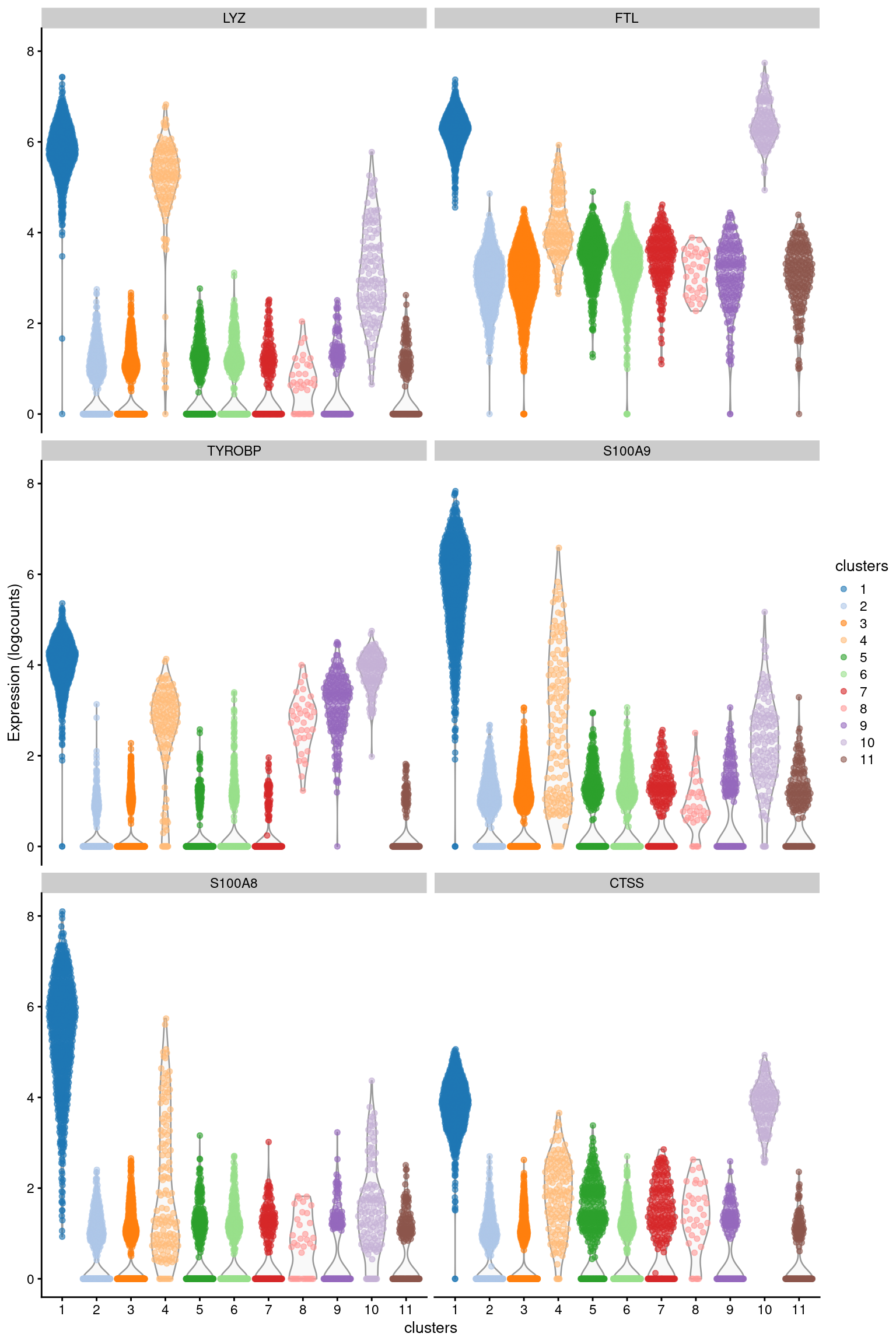
Figure 7.1: Distribution of log-expression values for the top marker genes of cluster 1 in the PBMC dataset.
Of course, the default cohens.d.mean is just one of many possible choices for ranking potential marker genes.
Different effect sizes or summary statistics can yield alternative rankings that may be more or less useful.
7.2.2 Choice of effect size
For each pairwise comparison, we compute several effect sizes to quantify the magnitude of differential expression between two clusters.
The choice of effect size influences the types of markers that are prioritized in rankings based on that effect size.
To demonstrate, we’ll look at the different rankings obtained for cluster 1 with each effect size.
(For consistency and simplicity, we will use the .mean summary in each example.)
Cohen’s \(d\) is defined as the difference in the mean between groups divided by the average standard deviation across groups. In other words, it is the number of standard deviations that separate the means of the two groups. When applied to log-expression values, Cohen’s \(d\) can be interpreted as a standardized log-fold change. Positive values indicate that the gene is upregulated in our cluster of interest, negative values indicate downregulation and values close to zero indicate that there is little difference. Cohen’s \(d\) is roughly analogous to the \(t\)-statistic in a two-sample \(t\)-test.
previewMarkers(chosen.markers.10x, pre.columns='Symbol', order.by="cohens.d.mean")## DataFrame with 10 rows and 5 columns
## Symbol mean detected lfc cohens.d.mean
## <character> <numeric> <numeric> <numeric> <numeric>
## ENSG00000090382 LYZ 5.80862 0.998729 4.47263 6.63007
## ENSG00000087086 FTL 6.24421 1.000000 2.67120 4.98157
## ENSG00000011600 TYROBP 4.05728 0.997459 2.65311 4.65609
## ENSG00000163220 S100A9 5.63461 0.996188 4.48435 4.56463
## ENSG00000143546 S100A8 5.37071 1.000000 4.50586 4.30814
## ENSG00000163131 CTSS 3.81179 0.997459 2.58808 3.88013
## ENSG00000101439 CST3 3.93963 0.998729 2.38272 3.76730
## ENSG00000085265 FCN1 2.75854 0.970775 2.36554 3.43847
## ENSG00000204482 LST1 2.90740 0.988564 2.05035 3.33141
## ENSG00000197956 S100A6 4.49784 0.998729 2.28517 3.19315The area under the curve (AUC) is the probability that a randomly chosen observation from our cluster of interest is greater than a randomly chosen observation from the other cluster. A value of 1 corresponds to upregulation, where all values of our cluster of interest are greater than any value from the other cluster; a value of 0.5 means that there is no difference in the location of the distributions; and a value of 0 corresponds to downregulation. The AUC is closely related to the \(U\) statistic in the Wilcoxon ranked sum test (a.k.a., Mann-Whitney U-test). Both the AUC and Cohen’s \(d\) tend to detect similar markers - the former is more robust to outliers but less sensitive to the magnitude of the differences between clusters, i.e., a greater difference between clusters will usually result in a larger Cohen’s \(d\) but may not change the AUC much if it’s already close to 0 or 1.
previewMarkers(chosen.markers.10x, pre.columns='Symbol', order.by="auc.mean")## DataFrame with 10 rows and 5 columns
## Symbol mean detected lfc auc.mean
## <character> <numeric> <numeric> <numeric> <numeric>
## ENSG00000143546 S100A8 5.37071 1.000000 4.50586 0.990912
## ENSG00000163220 S100A9 5.63461 0.996188 4.48435 0.988210
## ENSG00000090382 LYZ 5.80862 0.998729 4.47263 0.973853
## ENSG00000257764 RP11-1143G9.4 2.86253 0.978399 2.54102 0.957043
## ENSG00000085265 FCN1 2.75854 0.970775 2.36554 0.949031
## ENSG00000163221 S100A12 2.59398 0.916137 2.48297 0.948650
## ENSG00000163131 CTSS 3.81179 0.997459 2.58808 0.944007
## ENSG00000197956 S100A6 4.49784 0.998729 2.28517 0.943195
## ENSG00000011600 TYROBP 4.05728 0.997459 2.65311 0.941867
## ENSG00000087086 FTL 6.24421 1.000000 2.67120 0.940033The “delta-detected” is the difference in the proportion of cells with detected (non-zero) expression between two clusters. A value of 1 indicates that all cells in the cluster of interest express a gene, while all cells in the other cluster do not; a value of zero indicates that there is no difference in the proportion; and a value of -1 indicates that expression is only found in the cells of the other cluster. Rankings based on the delta-detected value will prioritize genes that are near-silent in the other cluster (Figure 7.2). When available, these genes are often very effective markers as they are only expressed in our cluster of interest. However, it is also possible that strong markers will not have a large delta-detected value, e.g., because they are expressed at a low constitutive level in the other cluster.
top.detected.10x <- previewMarkers(chosen.markers.10x, pre.columns='Symbol', order.by="delta.detected.mean")
top.detected.10x
## DataFrame with 10 rows and 5 columns
## Symbol mean detected lfc delta.detected.mean
## <character> <numeric> <numeric> <numeric> <numeric>
## ENSG00000163221 S100A12 2.59398 0.916137 2.48297 0.797889
## ENSG00000038427 VCAN 1.95980 0.885642 1.84785 0.787284
## ENSG00000257764 RP11-1143G9.4 2.86253 0.978399 2.54102 0.758067
## ENSG00000163563 MNDA 2.50935 0.960610 2.13786 0.733194
## ENSG00000121552 CSTA 2.30972 0.949174 1.97753 0.729536
## ENSG00000085265 FCN1 2.75854 0.970775 2.36554 0.718534
## ENSG00000100079 LGALS2 2.10228 0.885642 1.82007 0.705982
## ENSG00000170458 CD14 1.39897 0.771283 1.32663 0.692697
## ENSG00000110077 MS4A6A 1.54823 0.829733 1.24222 0.643400
## ENSG00000127951 FGL2 1.48230 0.846252 1.22767 0.638580plotExpression(
sce.nn.10x,
features=top.detected.10x$Symbol[1:6],
swap_rownames="Symbol",
x="clusters",
colour_by="clusters"
)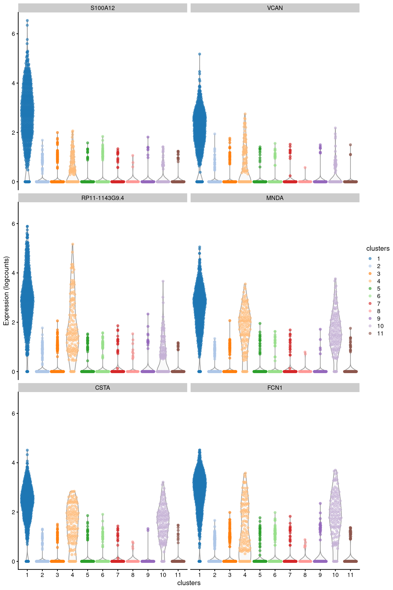
Figure 7.2: Distribution of log-expression values for the top marker genes of cluster 1 in the PBMC dataset, ranked by the mean delta-detected.
Finally, the “delta-mean” is the difference in the mean between two clusters. When computed on the log-normalized expression values, this is simply a fancy name for the log-fold change between clusters. In most cases, Cohen’s \(d\) or the AUC are better choices as they account for the variance within each cluster. Nonetheless, the log-fold changes are still useful as their values are easier to interpret. They can also help to diagnose pathological situations where large Cohen’s \(d\) or AUC values are driven by small variances instead of large differences between clusters.
# Same as the 'lfc' column.
previewMarkers(chosen.markers.10x, pre.columns='Symbol', order.by="delta.mean.mean")
## DataFrame with 10 rows and 5 columns
## Symbol mean detected lfc delta.mean.mean
## <character> <numeric> <numeric> <numeric> <numeric>
## ENSG00000143546 S100A8 5.37071 1.000000 4.50586 4.50586
## ENSG00000163220 S100A9 5.63461 0.996188 4.48435 4.48435
## ENSG00000090382 LYZ 5.80862 0.998729 4.47263 4.47263
## ENSG00000087086 FTL 6.24421 1.000000 2.67120 2.67120
## ENSG00000011600 TYROBP 4.05728 0.997459 2.65311 2.65311
## ENSG00000163131 CTSS 3.81179 0.997459 2.58808 2.58808
## ENSG00000257764 RP11-1143G9.4 2.86253 0.978399 2.54102 2.54102
## ENSG00000163221 S100A12 2.59398 0.916137 2.48297 2.48297
## ENSG00000101439 CST3 3.93963 0.998729 2.38272 2.38272
## ENSG00000085265 FCN1 2.75854 0.970775 2.36554 2.36554Keep in mind that effect sizes are defined relative to other clusters in the same dataset. Biologically meaningful genes will not be detected as markers if they are expressed uniformly throughout the population, e.g., T cell markers will not be detected if only T cells are present in the dataset. This is usually not a problem as we should have some prior knowledge about the identity of the cell population, e.g., we should know we’ve isolated T cells for our experiment25. Nonetheless, if “absolute” identification of cell types is desired, we need to use cell type annotation methods like SingleR.
7.2.3 Summarizing pairwise effects
As mentioned above, we perform pairwise comparisons between clusters to find differentially expressed genes. For each gene, we obtain one effect size of a given type from each pair of clusters; so in a dataset with \(N\) clusters, each cluster will have \(N-1\) effect sizes for consideration. To simplify interpretation, we summarize the effect sizes for each cluster into key statistics such as the mean and median. This allows us to create a ranking of potential marker genes based on one of the summary statistics for a given effect size.
The mean and median are the most obvious and general-purpose summary statistics. For cluster \(X\), a large mean effect size indicates that the gene is upregulated in \(X\) compared to the average of the other groups. Similarly, a large median effect size indicates that the gene is upregulated in \(X\) compared to most (>50%) other clusters. The median is more robust (or less sensitive, depending on one’s perspective) than the mean to large effect sizes in a minority of comparisons, which may or may not be desirable. In practice, these summaries usually generate similar rankings.
previewMarkers(chosen.markers.10x, pre.columns='Symbol', order.by="cohens.d.median")## DataFrame with 10 rows and 5 columns
## Symbol mean detected lfc cohens.d.median
## <character> <numeric> <numeric> <numeric> <numeric>
## ENSG00000090382 LYZ 5.80862 0.998729 4.47263 7.52540
## ENSG00000011600 TYROBP 4.05728 0.997459 2.65311 6.13868
## ENSG00000087086 FTL 6.24421 1.000000 2.67120 5.59914
## ENSG00000101439 CST3 3.93963 0.998729 2.38272 5.33218
## ENSG00000163220 S100A9 5.63461 0.996188 4.48435 4.98685
## ENSG00000143546 S100A8 5.37071 1.000000 4.50586 4.61885
## ENSG00000204482 LST1 2.90740 0.988564 2.05035 4.17765
## ENSG00000163131 CTSS 3.81179 0.997459 2.58808 4.11857
## ENSG00000085265 FCN1 2.75854 0.970775 2.36554 3.96423
## ENSG00000204472 AIF1 2.83022 0.978399 2.09265 3.80569The minimum value is the most stringent summary for identifying upregulated genes. A large minimum value indicates that the gene is upregulated in \(X\) compared to all other clusters. Ranking on the minimum is a high-risk, high-reward approach; it can yield a concise set of excellent markers that are unique to \(X\), but can also overlook interesting genes if they are expressed at a similar level in any other cluster. The latter effect is not uncommon if the clusters correspond to closely-related cell types. To give a concrete example, consider a mixed population of CD4+-only, CD8+-only, double-positive and double-negative T cells. Neither Cd4 or Cd8 would be detected as subpopulation-specific markers because each gene is expressed in two subpopulations.
previewMarkers(chosen.markers.10x, pre.columns='Symbol', order.by="cohens.d.min")## DataFrame with 10 rows and 5 columns
## Symbol mean detected lfc cohens.d.min
## <character> <numeric> <numeric> <numeric> <numeric>
## ENSG00000143546 S100A8 5.37071 1.000000 4.505863 2.442256
## ENSG00000163221 S100A12 2.59398 0.916137 2.482974 2.174899
## ENSG00000163220 S100A9 5.63461 0.996188 4.484354 2.134705
## ENSG00000038427 VCAN 1.95980 0.885642 1.847852 1.519953
## ENSG00000170458 CD14 1.39897 0.771283 1.326635 1.509846
## ENSG00000085265 FCN1 2.75854 0.970775 2.365537 1.071372
## ENSG00000121552 CSTA 2.30972 0.949174 1.977535 1.008715
## ENSG00000198886 MT-ND4 4.27689 1.000000 0.742434 0.935270
## ENSG00000163563 MNDA 2.50935 0.960610 2.137860 0.926516
## ENSG00000257764 RP11-1143G9.4 2.86253 0.978399 2.541024 0.903887Another interesting summary statistic is the minimum rank, a.k.a., “min-rank”. The min-rank is the smallest rank of each gene across all pairwise comparisons involving our cluster of interest \(X\). Specifically, genes are ranked within each pairwise comparison based on decreasing effect size, and then the smallest rank across all comparisons is reported for each gene. A gene with a small min-rank is one of the top upregulated genes in at least one comparison between \(X\) and another cluster. Or in other words: the set of all genes with a min-rank less than or equal to \(R\) is equal to the union of the top \(R\) genes from all pairwise comparisons for \(X\). This guarantees that our set contains at least \(R\) genes that can distinguish our cluster of interest from any other cluster, which enables a comprehensive determination of a cluster’s identity.
previewMarkers(chosen.markers.10x, pre.columns='Symbol', order.by="cohens.d.min.rank")## DataFrame with 10 rows and 5 columns
## Symbol mean detected lfc cohens.d.min.rank
## <character> <numeric> <numeric> <numeric> <integer>
## ENSG00000090382 LYZ 5.80862 0.998729 4.47263 1
## ENSG00000087086 FTL 6.24421 1.000000 2.67120 1
## ENSG00000143546 S100A8 5.37071 1.000000 4.50586 1
## ENSG00000011600 TYROBP 4.05728 0.997459 2.65311 2
## ENSG00000163220 S100A9 5.63461 0.996188 4.48435 2
## ENSG00000163131 CTSS 3.81179 0.997459 2.58808 2
## ENSG00000101439 CST3 3.93963 0.998729 2.38272 2
## ENSG00000163221 S100A12 2.59398 0.916137 2.48297 4
## ENSG00000085265 FCN1 2.75854 0.970775 2.36554 5
## ENSG00000257764 RP11-1143G9.4 2.86253 0.978399 2.54102 5# min.rank <= 5 means represents the union of the top 5 genes from each
# pairwise comparison between our chosen cluster and every other cluster.
chosen.markers.10x$Symbol[chosen.markers.10x$cohens.d.min.rank <= 5]## [1] "LYZ" "FTL" "TYROBP" "S100A9"
## [5] "S100A8" "CTSS" "CST3" "FCN1"
## [9] "RP11-1143G9.4" "S100A12" "NEAT1"The flexibility to choose between different summary statistics is one of the strengths of our pairwise strategy. This allows us to explore different rankings of markers depending on our preferences. For example, the min-rank is a conservative choice as it guarantees separation of our cluster of interest, at the cost of including weaker DE genes in the top set of markers; while the minimum provides an aggressive ranking that focuses on markers that are uniquely expressed in our cluster (if any exist). Pairwise comparisons are also robust to differences in the relative number of cells between clusters, which ensures that a single large cluster does not dominate the calculation of effect sizes for all other clusters.
7.3 Visualizing marker genes
At this point, we suppose that we ought to create some figures to keep everyone entertained. We have already demonstrated how we can examine the distribution of expression values with violin plots in Figure 7.1. Another option is to color our \(t\)-SNE plot according to the log-expression values of a specific marker in each cell (Figure 7.3). Any heterogeneity in expression within our cluster might be indicative of internal structure.
gridExtra::grid.arrange(
    plotReducedDim(sce.nn.10x, "TSNE", colour_by="clusters"),
    plotReducedDim(sce.nn.10x, "TSNE", colour_by=chosen.markers.10x$Symbol[1], swap_rownames="Symbol"),
    ncol=2
)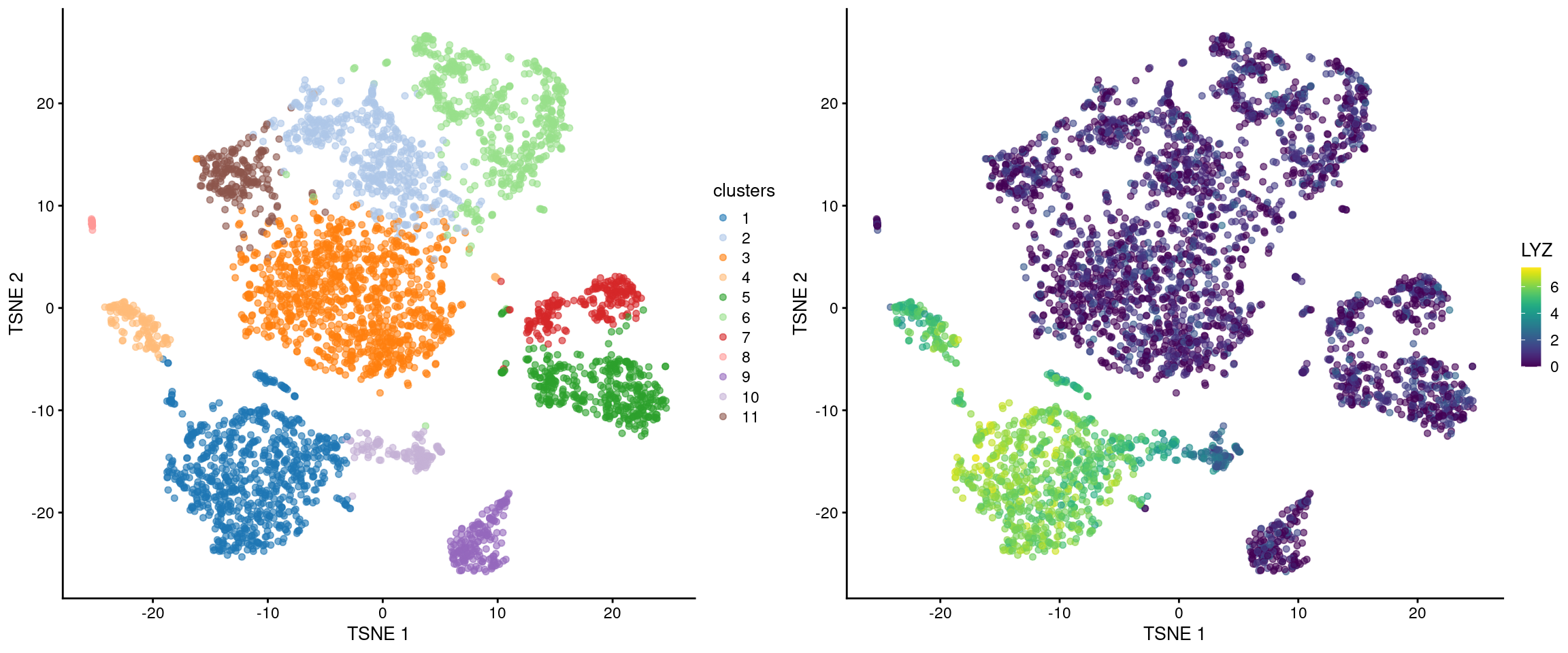
Figure 7.3: \(t\)-SNE plot of the cells in the PBMC dataset, colored by the assigned cluster (top) or the log-expression of the top marker gene in cluster 1 (bottom).
The heatmap is a classic visualization in genomics, and scRNA-seq is no exception (Figure 7.4). This provides a compact summary of the relative expression of multiple markers across the cell population. Ideally, each marker should be consistently upregulated within our cluster of interest compared to the rest of the cells in the population.
plotHeatmap(sce.nn.10x, features=chosen.markers.10x$Symbol[1:10], order_columns_by="clusters", swap_rownames="Symbol", center=TRUE)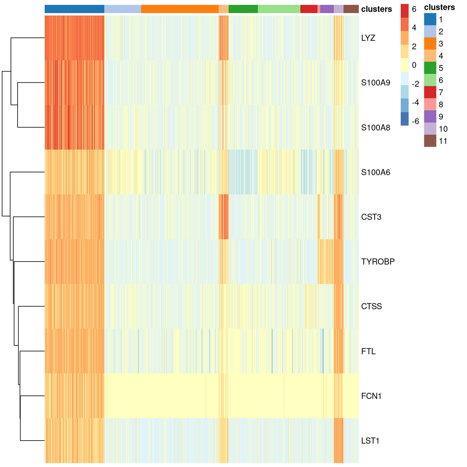
Figure 7.4: Heatmap of the top markers for cluster 1 in the PBMC dataset. Each row represents a gene and each column represents a cell. Each entry is colored by the log-fold change for each cell from the mean log-expression for that gene.
Another popular visualization is the seurat-style “dot plot”26, also known as a bubble plot (Figure 7.5). This is more concise than the heatmap as it uses the size of each dot/bubble to represent the proportion of cells with detected expression. Personally, we disapprove of using variable areas to represent data as this can generate misleading visualizations27, but hey, to each their own.
plotDots(sce.nn.10x, features=chosen.markers.10x$Symbol[1:10], group="clusters", swap_rownames="Symbol", center=TRUE)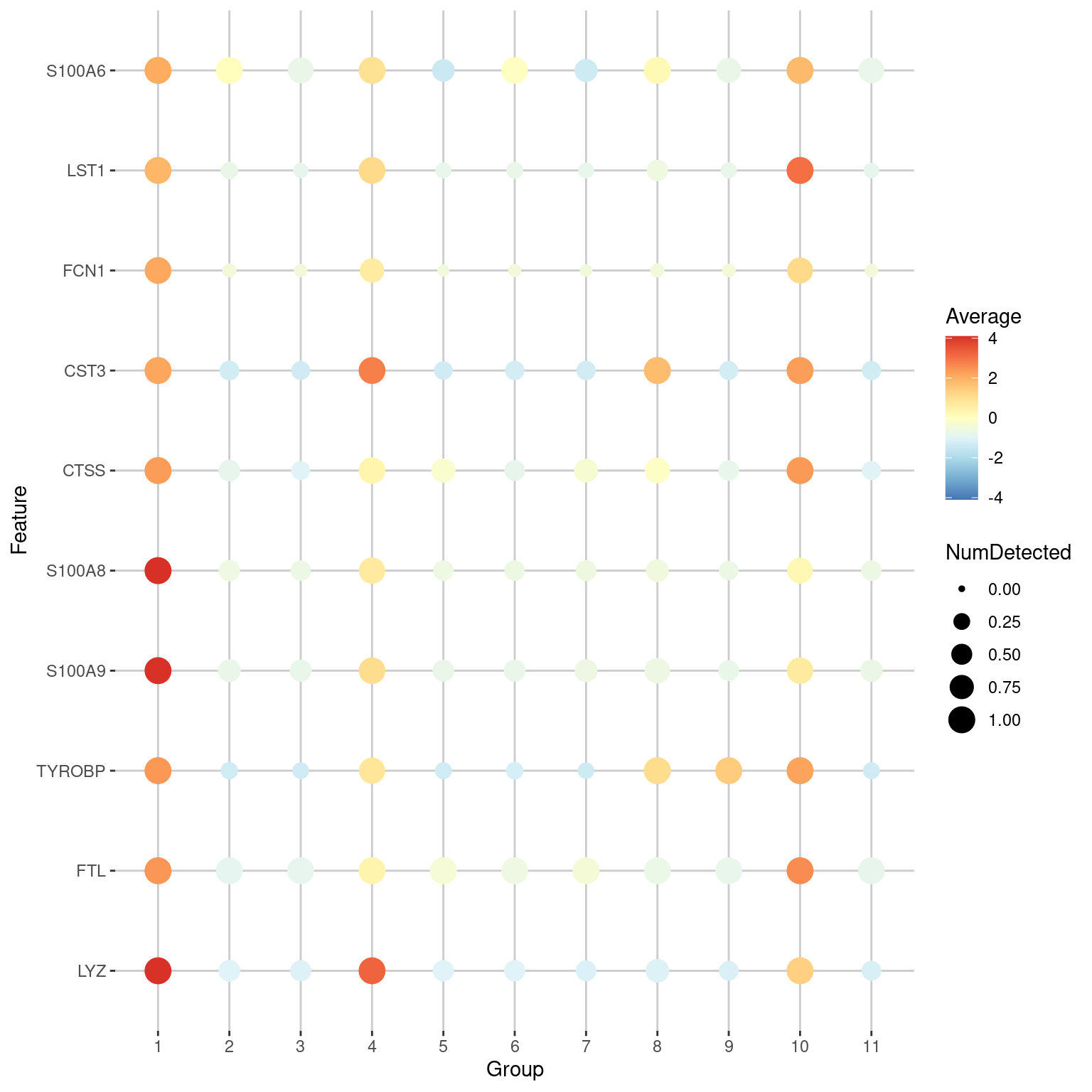
Figure 7.5: Dot plot of the top markers for cluster 1 in the PBMC dataset. The size of each point represents the number of cells that express each gene in each cluster, while the color of each point represents the log-fold change between the cluster and the average across all clusters.
7.4 Using a log-fold change threshold
The Cohen’s \(d\) and AUC consider both the magnitude of the difference between clusters as well as the variability within each cluster. If the variability is low, it is possible for a gene to have a large effect size even if the magnitude of the difference is small. These genes tend to be uninformative for cell type identification, e.g., ribosomal protein genes. We would prefer genes with larger log-fold changes between clusters, even if they have higher variability (McCarthy and Smyth 2009).
To favor the detection of such genes, we can compute the effect sizes relative to a log-fold change threshold. The definition of Cohen’s \(d\) is generalized to the standardized difference between the observed log-fold change and the specified threshold. Similarly, the AUC is redefined as the probability of randomly picking an expression value from one cluster that is greater than a random value from the other cluster plus the threshold. A large positive Cohen’s \(d\) and an AUC above 0.5 can only be obtained if the observed log-fold change between clusters is significantly greater than the threshold. (However, a negative Cohen’s \(d\) or AUC below 0.5 may not represent downregulation; it may just indicate that the observed log-fold change is less than the specified threshold.)
markers.threshold.10x <- scoreMarkers.se(
    sce.nn.10x,
    sce.nn.10x$clusters,
    extra.columns='Symbol',
    more.marker.args=list(threshold=2)
)

chosen.markers.threshold.10x <- markers.threshold.10x[[chosen.cluster]]

# Default ordering by the mean of Cohen's d.
previewMarkers(chosen.markers.threshold.10x, pre.columns="Symbol", post.columns="cohens.d.mean")
## DataFrame with 10 rows and 5 columns
## Symbol mean detected lfc cohens.d.mean
## <character> <numeric> <numeric> <numeric> <numeric>
## ENSG00000090382 LYZ 5.80862 0.998729 4.47263 3.777706
## ENSG00000163220 S100A9 5.63461 0.996188 4.48435 2.556023
## ENSG00000143546 S100A8 5.37071 1.000000 4.50586 2.411830
## ENSG00000011600 TYROBP 4.05728 0.997459 2.65311 1.190628
## ENSG00000087086 FTL 6.24421 1.000000 2.67120 1.158359
## ENSG00000163131 CTSS 3.81179 0.997459 2.58808 0.836300
## ENSG00000101439 CST3 3.93963 0.998729 2.38272 0.703171
## ENSG00000257764 RP11-1143G9.4 2.86253 0.978399 2.54102 0.686771
## ENSG00000085265 FCN1 2.75854 0.970775 2.36554 0.614933
## ENSG00000163221 S100A12 2.59398 0.916137 2.48297 0.517954# Also looking at the order by the mean of the AUCs.
previewMarkers(chosen.markers.threshold.10x, pre.columns="Symbol", order.by="auc.mean")## DataFrame with 10 rows and 5 columns
## Symbol mean detected lfc auc.mean
## <character> <numeric> <numeric> <numeric> <numeric>
## ENSG00000163220 S100A9 5.63461 0.996188 4.48435 0.929055
## ENSG00000143546 S100A8 5.37071 1.000000 4.50586 0.928191
## ENSG00000090382 LYZ 5.80862 0.998729 4.47263 0.880932
## ENSG00000087086 FTL 6.24421 1.000000 2.67120 0.807194
## ENSG00000163131 CTSS 3.81179 0.997459 2.58808 0.713752
## ENSG00000257764 RP11-1143G9.4 2.86253 0.978399 2.54102 0.686833
## ENSG00000085265 FCN1 2.75854 0.970775 2.36554 0.678680
## ENSG00000101439 CST3 3.93963 0.998729 2.38272 0.662480
## ENSG00000163221 S100A12 2.59398 0.916137 2.48297 0.656001
## ENSG00000011600 TYROBP 4.05728 0.997459 2.65311 0.640162In general, we only use a threshold if irrelevant genes with low variances are interfering with our interpretation of the clusters. Weakly expressed genes will often have low log-fold changes due to the pseudo-count shrinkage (Chapter 2), and genes that separate closely-related clusters will usually have smaller log-fold changes. Prematurely using a large threshold will prevent the detection of these potentially interesting genes.
7.5 Blocking on uninteresting factors
Larger datasets may contain multiple blocks of cells where the differences between blocks are uninteresting, e.g., batch effects, variability between donors. These differences can interfere with marker gene detection by (i) inflating the variance within each cluster and (ii) distorting the log-fold changes if the cluster composition varies between blocks. To avoid these issues, we block on any uninteresting factors when computing the effect sizes. Let’s demonstrate on a mouse trophoblast dataset (A. T. L. Lun et al. 2017) generated across two plates, where any differences between plates are technical and should not be allowed to influence the marker statistics.
library(scRNAseq)
sce.tropho <- LunSpikeInData("tropho")
sce.tropho$block <- factor(sce.tropho$block)
table(sce.tropho$block) # i.e., plate of origin.
##
## 20160906 20170201
## 96 96# Computing the QC metrics. For brevity, we'll skip the spike-ins.
library(scrapper)
is.mito.tropho <- which(any(seqnames(rowRanges(sce.tropho))=="MT"))
sce.qc.tropho <- quickRnaQc.se(sce.tropho, subsets=list(MT=is.mito.tropho), block=sce.tropho$block)
sce.qc.tropho <- sce.tropho[,sce.qc.tropho$keep]
# Computing log-normalized expression values.
sce.norm.tropho <- normalizeRnaCounts.se(sce.qc.tropho, size.factors=sce.qc.tropho$sum, block=sce.qc.tropho$block)
# We now choose the top HVGs.
sce.var.tropho <- chooseRnaHvgs.se(sce.norm.tropho, block=sce.norm.tropho$block)
# Running the PCA on the HVG submatrix.
sce.pca.tropho <- runPca.se(sce.var.tropho, features=rowData(sce.var.tropho)$hvg, block=sce.var.tropho$block)
# Doing some graph-based clustering.
sce.nn.tropho <- runAllNeighborSteps.se(sce.pca.tropho)We set block= to instruct scoreMarkers.se() to perform the pairwise comparisons separately in each block, i.e., plate.
Specifically, for a comparison between two clusters, we compute one effect size per plate where we only use cells in that plate.
By performing comparisons within each plate, we cancel out any differences between plates so that they do not interfere with our effect sizes.
The per-plate effect sizes are then averaged across plates to obtain a single value per comparison,
using a weighted mean that accounts for the number of cells involved in the comparison in each plate.
A similar average across plates is computed for the mean log-expression and proportion of detected cells.
markers.tropho <- scoreMarkers.se(sce.nn.tropho, sce.nn.tropho$clusters, block=sce.nn.tropho$block)
previewMarkers(markers.tropho[["1"]])
## DataFrame with 10 rows and 3 columns
## mean detected lfc
## <numeric> <numeric> <numeric>
## ENSMUSG00000027306 6.50487 0.914894 4.19102
## ENSMUSG00000006398 10.20393 1.000000 1.33125
## ENSMUSG00000084301 6.90226 1.000000 1.30211
## ENSMUSG00000083407 3.02553 0.936170 1.63986
## ENSMUSG00000083907 4.10552 1.000000 1.59130
## ENSMUSG00000001403 9.20855 1.000000 1.99050
## ENSMUSG00000074802 5.14600 0.872340 2.90355
## ENSMUSG00000030867 8.95573 1.000000 2.10757
## ENSMUSG00000048574 8.75497 1.000000 1.03204
## ENSMUSG00000030654 9.94568 1.000000 1.18929By default, we do not explicitly penalize genes that behave inconsistently across blocks. This is generally unnecessary as the average favors genes with large effect sizes in the same direction in all blocks. That said, it is theoretically possible for a top marker to have highly variable effect sizes across plates, as long as the average is large. We can check this by visualizing the expression profile of a gene of interest with respect to the plate (Figure 7.6). Ideally, our gene would behave consistently across plates.
plotExpression(
    sce.nn.tropho,
    features=rownames(markers.tropho[["1"]])[1],
    x="clusters",
    colour_by="clusters",
    other_fields="block"
) +
    facet_grid(~block)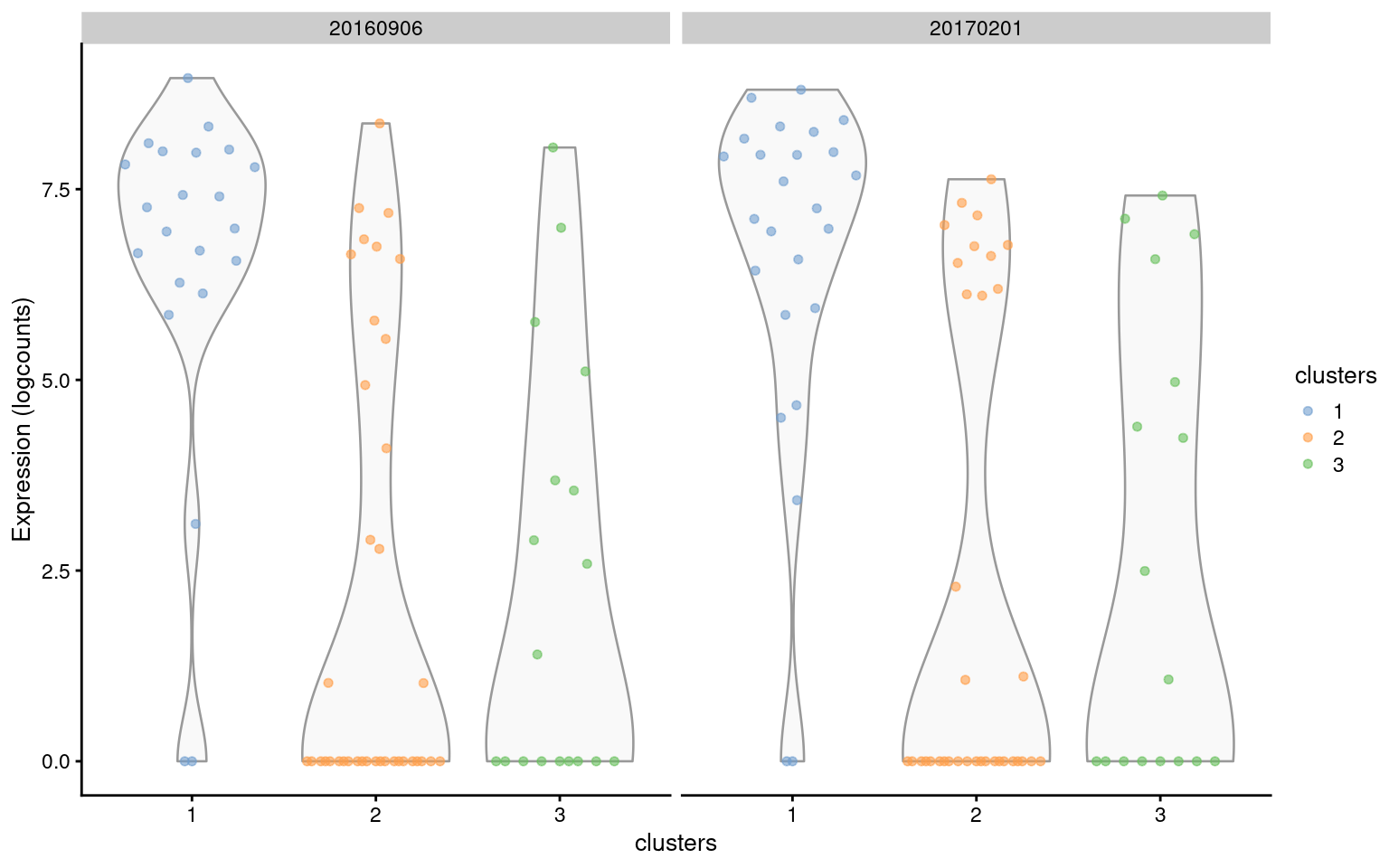
Figure 7.6: Distribution of expression values for the top-ranked marker gene (ENSMUSG00000027306) of cluster 1 in the trophoblast dataset. Distributions are shown for each cluster (x-axis) in each plate (panel).
If we really want to enforce consistent DE across blocks, we can ask scoreMarkers.se() to instead compute a quantile instead of a weighted mean.
For example, rankings derived from the minimum effect size across blocks will focus on genes that exhibit large changes in the same direction within each block.
markers.min.tropho <- scoreMarkers.se(
    sce.nn.tropho,
    sce.nn.tropho$clusters,
    block=sce.nn.tropho$block,
    more.marker.args=list(
        block.average.policy="quantile",
        block.quantile=0 # i.e., minimum.
    )
)
previewMarkers(markers.min.tropho[["1"]])
## DataFrame with 10 rows and 3 columns
## mean detected lfc
## <numeric> <numeric> <numeric>
## ENSMUSG00000027306 6.46814 0.909091 4.083865
## ENSMUSG00000006398 9.99817 1.000000 1.114116
## ENSMUSG00000001403 9.19752 1.000000 1.782523
## ENSMUSG00000084301 6.78050 1.000000 1.113203
## ENSMUSG00000030867 8.73720 1.000000 1.855625
## ENSMUSG00000083907 3.94614 1.000000 1.346573
## ENSMUSG00000029177 8.42776 1.000000 0.690333
## ENSMUSG00000083407 2.61290 0.880000 1.247344
## ENSMUSG00000048574 8.52426 1.000000 0.933816
## ENSMUSG00000084133 7.38314 1.000000 0.894224Blocking in scoreMarkers.se() assumes that each pair of clusters is present in at least one block in order to perform a comparison within the block.
In scenarios where cells from two clusters never co-occur in the same block,
the associated pairwise comparison will be impossible and is ignored during calculation of summary statistics.
This can be problematic in rare situations where the blocks are perfectly confounded with the clusters,
though marker detection is likely to be the least of our concerns with an experimental design of this calibre.
7.6 More uses for the marker scores
Our discussion above focuses on genes that are upregulated in our cluster of interest, as these are the easiest to interpret and experimentally validate. However, a cluster may occasionally be defined by downregulation of some genes relative to the rest of the cell population. In such cases, we can reverse the rankings to see if there is any consistent downregulation compared to other clusters. Alternatively, we can recognize that any downregulated genes in cluster \(X\) should manifest as upregulated genes in other clusters when compared to \(X\). By using a summary like the min-rank, we guarantee that these genes will show up somewhere, i.e., as markers of other clusters. (Other summaries are less effective as the upregulation only applies to comparisons against \(X\) and may not cause a noticeable increase in the mean/median summary.)
# Ordering by increasing Cohen's d.
reversed.chosen.markers.10x <- chosen.markers.10x[order(chosen.markers.10x$cohens.d.mean),]
previewMarkers(reversed.chosen.markers.10x, pre.columns="Symbol", post.columns="cohens.d.mean")
## DataFrame with 10 rows and 5 columns
## Symbol mean detected lfc cohens.d.mean
## <character> <numeric> <numeric> <numeric> <numeric>
## ENSG00000213741 RPS29 3.946430 1.000000 -1.062005 -2.31360
## ENSG00000177954 RPS27 5.043689 1.000000 -0.830939 -2.26035
## ENSG00000100316 RPL3 3.650995 0.997459 -0.953517 -1.94125
## ENSG00000198242 RPL23A 3.480505 0.996188 -0.996558 -1.93683
## ENSG00000168028 RPSA 1.923204 0.869123 -1.394956 -1.79849
## ENSG00000149273 RPS3 3.569838 0.996188 -0.870643 -1.70630
## ENSG00000227507 LTB 0.579215 0.428208 -1.448969 -1.67086
## ENSG00000071082 RPL31 3.228407 0.987294 -0.893312 -1.57149
## ENSG00000105372 RPS19 4.003734 0.998729 -0.727010 -1.53771
## ENSG00000137154 RPS6 4.130116 0.997459 -0.699234 -1.48973Occasionally, we are only interested in markers for a subset of the clusters. Imagine that we have a set of closely-related clusters and we want to identify the genes that distinguish these clusters from each other. The summary statistics generated from all clusters might not be satisfactory as they will not prioritize genes with weak upregulation between related clusters. (Except for min-rank, where these genes would at least show up near the top of the ranking. But they would be surrounded by many irrelevant genes from comparisons to other clusters.) Instead, we can just compute marker scores from the cells in the selected subset of clusters:
# Let's pretend that clusters 1, 2 and 3 are of particular interest and
# we want to find markers between them.
subset.clusters.10x <- sce.nn.10x$clusters %in% c("1", "2", "3")
subset.markers.10x <- scoreMarkers.se(
    sce.nn.10x[,subset.clusters.10x],
    sce.nn.10x$clusters[subset.clusters.10x],
    extra.columns="Symbol"
)

# Now let's have a look at the top markers for cluster 2.
previewMarkers(subset.markers.10x[["2"]], pre.columns="Symbol")
## DataFrame with 10 rows and 4 columns
## Symbol mean detected lfc
## <character> <numeric> <numeric> <numeric>
## ENSG00000008517 IL32 3.02931 0.979466 1.977099
## ENSG00000227507 LTB 3.37330 0.991786 1.778829
## ENSG00000277734 TRAC 2.53751 0.973306 1.308343
## ENSG00000168685 IL7R 1.73999 0.839836 1.205725
## ENSG00000167286 CD3D 1.91705 0.942505 0.896106
## ENSG00000166710 B2M 6.25505 1.000000 0.487200
## ENSG00000213741 RPS29 5.40264 1.000000 0.632544
## ENSG00000206503 HLA-A 3.74897 0.997947 0.836841
## ENSG00000116824 CD2 1.21460 0.770021 0.801813
## ENSG00000234745 HLA-B 4.70730 1.000000 0.618141For more control on the selected markers, we can filter our data frame on the available statistics. For example, we might only consider genes as markers if they have detected proportions above 50%, a mean log-expression greater than 1, an average difference in the detected proportions above 50%, and an average log-fold change above 1. We tend to avoid a priori filtering as it is difficult to choose thresholds that are generally applicable. Nonetheless, it can be useful to refine the set of markers once we know what we’re interested in.
filtered.markers.10x <- chosen.markers.10x[
    chosen.markers.10x$detected >= 0.5 &
    chosen.markers.10x$mean >= 1 &
    chosen.markers.10x$delta.detected.mean >= 0.5 &
    chosen.markers.10x$delta.mean.mean >= 1,
]
previewMarkers(filtered.markers.10x, pre.columns="Symbol", post.columns=c("delta.detected.mean"))
## DataFrame with 10 rows and 5 columns
## Symbol mean detected lfc delta.detected.mean
## <character> <numeric> <numeric> <numeric> <numeric>
## ENSG00000085265 FCN1 2.75854 0.970775 2.36554 0.718534
## ENSG00000204482 LST1 2.90740 0.988564 2.05035 0.581743
## ENSG00000121552 CSTA 2.30972 0.949174 1.97753 0.729536
## ENSG00000204472 AIF1 2.83022 0.978399 2.09265 0.615761
## ENSG00000257764 RP11-1143G9.4 2.86253 0.978399 2.54102 0.758067
## ENSG00000163563 MNDA 2.50935 0.960610 2.13786 0.733194
## ENSG00000163221 S100A12 2.59398 0.916137 2.48297 0.797889
## ENSG00000038427 VCAN 1.95980 0.885642 1.84785 0.787284
## ENSG00000100079 LGALS2 2.10228 0.885642 1.82007 0.705982
## ENSG00000025708 TYMP 2.15622 0.932656 1.56581 0.5672707.7 Invalidity of \(p\)-values
In the old days, we used to report \(p\)-values along with the effect sizes for the detected markers. After all, Cohen’s \(d\) and the AUC are closely related to \(t\)-tests and the Wilcoxon ranked sum test, respectively. Unfortunately, the statistical interpretation of \(p\)-values is compromised when identifying cluster-specific markers.
The first issue is that of “data dredging” (also known as fishing or data snooping) when the DE analysis is performed on the same data used to define the clusters. We are more likely to get a positive result when we use a dataset to test a hypothesis generated from that data. Or more simply - clustering will separate cells by expression, so of course we will get low \(p\)-values when we compare between clusters! To illustrate, let’s simulate i.i.d. normal values, perform \(k\)-means clustering and test for DE between clusters of cells with Wilcoxon ranked sum tests. Our input data is random so we’d expect a uniform distribution of \(p\)-values under the null hypothesis, but instead it is skewed towards low values (Figure 7.7). This means that we can detect “significant” differences between clusters even in the absence of any real substructure in the data.
set.seed(0)
y <- matrix(rnorm(1000000), ncol=200)
clusters <- kmeans(t(y), centers=2)$cluster
out <- apply(y, 1, FUN=function(x) {
    wilcox.test(x[clusters==1], x[clusters==2])$p.value
})
hist(out, col="grey80", xlab="p-value", main="")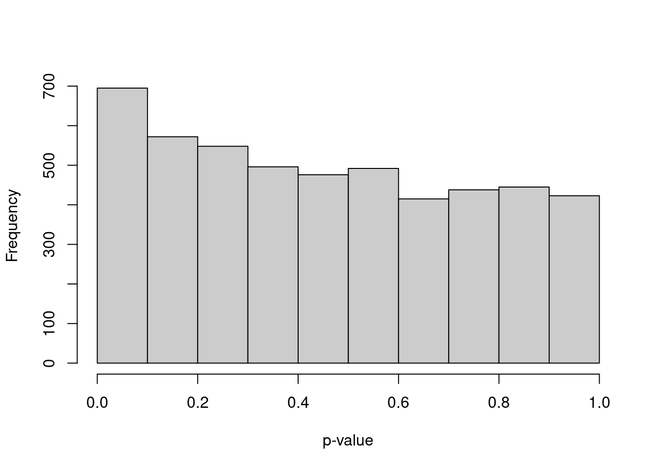
Figure 7.7: Distribution of \(p\)-values from a DE analysis between two clusters in a simulation with no true subpopulation structure.
Another problem is that many \(p\)-value calculations treat counts from different cells in the same cluster as replicate observations. This is not the most relevant level of replication when cells are derived from the same biological sample, i.e., cell culture, animal or patient. DE analyses that treat cells as replicates fail to properly model the sample-to-sample variability (A. T. L. Lun and Marioni 2017). This is arguably the more important level of replication as different samples will necessarily be generated if the experiment is to be repeated. In other words, if the experiment involved a single biological sample, the sample size is actually just 1, regardless of how many individual cells were assayed. By treating cells as replicates, we overstate our sample size and obtain much lower \(p\)-values than would be appropriate.
In short, the \(p\)-values for marker genes don’t make much sense from a statistical perspective. We can still use them for ranking, but at that point, we might as well make our life simpler and use the effect sizes directly. If we really want to determine whether some markers are “real”, the best approach is to perform a separate validation experiment with an independent replicate cell population. A typical strategy is to use different experimental techniques like FACS, FISH, qPCR or IHC to find a subpopulation that expresses the marker(s) of interest. This confirms that the subpopulation actually exists and is not an artifact of the scRNA-seq protocol or the computational analysis.
7.8 Gene set enrichment
We can summarize the biological functions of our top-ranked marker genes with gene set enrichment analyses. Here, we extract predefined sets of genes for specific pathways or processes and check if any gene set is overrepresented among our set of top markers. This reduces some of the hassle of manually examining the annotation for each gene to assign biological meaning to each cluster. To illustrate, we’ll use the gene ontology (GO)’s biological process (BP) subcategory, which defines gene sets associated with known biological processes (Ashburner et al. 2000). We might also consider other useful gene set collections like KEGG and REACTOME - see the MSigDB overview for details.
library(msigdbr)
go.bp.df <- msigdbr(species="Homo sapiens", collection="C5", subcollection="GO:BP")
go.bp.sets <- split(go.bp.df$ensembl_gene, go.bp.df$gs_name)
We use the hypergeometric test to quantify enrichment of each gene set among the top markers for cluster 1. The \(p\)-value of each gene set is determined by the number of shared genes between each GO set and the top markers, relative to the size of the GO set. More strongly enriched sets will have lower \(p\)-values and should be prioritized for interpretation. Here, we have chosen the top 100 markers but different values can be used depending on how many markers are of interest.
# Choosing the top 100 genes with positive Cohen's d values.
top.chosen.10x <- head(rownames(chosen.markers.10x)[chosen.markers.10x$cohens.d.mean > 0], 100)

library(scrapper)
enrich.chosen.10x <- testEnrichment(top.chosen.10x, go.bp.sets, universe=rownames(chosen.markers.10x))

# Prioritizing the most enriched gene sets for examination.
enrich.chosen.10x <- enrich.chosen.10x[order(enrich.chosen.10x$p.value),,drop=FALSE]
head(enrich.chosen.10x)
## DataFrame with 6 rows and 3 columns
## overlap
## <integer>
## GOBP_BIOLOGICAL_PROCESS_INVOLVED_IN_INTERSPECIES_INTERACTION_BETWEEN_ORGANISMS 42
## GOBP_INFLAMMATORY_RESPONSE 30
## GOBP_DEFENSE_RESPONSE_TO_OTHER_ORGANISM 34
## GOBP_REGULATION_OF_IMMUNE_SYSTEM_PROCESS 35
## GOBP_REGULATION_OF_RESPONSE_TO_EXTERNAL_STIMULUS 30
## GOBP_REGULATION_OF_DEFENSE_RESPONSE 27
## size
## <integer>
## GOBP_BIOLOGICAL_PROCESS_INVOLVED_IN_INTERSPECIES_INTERACTION_BETWEEN_ORGANISMS 1811
## GOBP_INFLAMMATORY_RESPONSE 896
## GOBP_DEFENSE_RESPONSE_TO_OTHER_ORGANISM 1318
## GOBP_REGULATION_OF_IMMUNE_SYSTEM_PROCESS 1639
## GOBP_REGULATION_OF_RESPONSE_TO_EXTERNAL_STIMULUS 1110
## GOBP_REGULATION_OF_DEFENSE_RESPONSE 847
## p.value
## <numeric>
## GOBP_BIOLOGICAL_PROCESS_INVOLVED_IN_INTERSPECIES_INTERACTION_BETWEEN_ORGANISMS 3.99853e-27
## GOBP_INFLAMMATORY_RESPONSE 1.72416e-23
## GOBP_DEFENSE_RESPONSE_TO_OTHER_ORGANISM 4.39440e-23
## GOBP_REGULATION_OF_IMMUNE_SYSTEM_PROCESS 3.94085e-21
## GOBP_REGULATION_OF_RESPONSE_TO_EXTERNAL_STIMULUS 7.52208e-21
## GOBP_REGULATION_OF_DEFENSE_RESPONSE 1.44840e-20# Focusing on some of the smaller, more specific gene sets.
head(enrich.chosen.10x[enrich.chosen.10x$size < 100,,drop=FALSE])## DataFrame with 6 rows and 3 columns
## overlap
## <integer>
## GOBP_ANTIGEN_PROCESSING_AND_PRESENTATION_OF_EXOGENOUS_PEPTIDE_ANTIGEN 7
## GOBP_ANTIGEN_PROCESSING_AND_PRESENTATION_OF_PEPTIDE_ANTIGEN 8
## GOBP_ANTIGEN_PROCESSING_AND_PRESENTATION_OF_EXOGENOUS_ANTIGEN 7
## GOBP_RESPONSE_TO_FUNGUS 8
## GOBP_NEUTROPHIL_CHEMOTAXIS 8
## GOBP_GRANULOCYTE_ACTIVATION 7
## size
## <integer>
## GOBP_ANTIGEN_PROCESSING_AND_PRESENTATION_OF_EXOGENOUS_PEPTIDE_ANTIGEN 39
## GOBP_ANTIGEN_PROCESSING_AND_PRESENTATION_OF_PEPTIDE_ANTIGEN 69
## GOBP_ANTIGEN_PROCESSING_AND_PRESENTATION_OF_EXOGENOUS_ANTIGEN 48
## GOBP_RESPONSE_TO_FUNGUS 80
## GOBP_NEUTROPHIL_CHEMOTAXIS 81
## GOBP_GRANULOCYTE_ACTIVATION 56
## p.value
## <numeric>
## GOBP_ANTIGEN_PROCESSING_AND_PRESENTATION_OF_EXOGENOUS_PEPTIDE_ANTIGEN 2.33097e-11
## GOBP_ANTIGEN_PROCESSING_AND_PRESENTATION_OF_PEPTIDE_ANTIGEN 3.25895e-11
## GOBP_ANTIGEN_PROCESSING_AND_PRESENTATION_OF_EXOGENOUS_ANTIGEN 1.09183e-10
## GOBP_RESPONSE_TO_FUNGUS 1.10001e-10
## GOBP_NEUTROPHIL_CHEMOTAXIS 1.21760e-10
## GOBP_GRANULOCYTE_ACTIVATION 3.37318e-10If we need more detail about a particular set, we can examine the behavior of its constituent genes.
top.set.10x <- rownames(enrich.chosen.10x)[1]
overlaps.top.set.10x <- intersect(go.bp.sets[[top.set.10x]], top.chosen.10x)
previewMarkers(
    chosen.markers.10x[rownames(chosen.markers.10x) %in% overlaps.top.set.10x,],
    pre.column="Symbol",
    rows=NULL # List all of the top genes in this set.
)
## DataFrame with 42 rows and 4 columns
## Symbol mean detected lfc
## <character> <numeric> <numeric> <numeric>
## ENSG00000090382 LYZ 5.80862 0.998729 4.47263
## ENSG00000011600 TYROBP 4.05728 0.997459 2.65311
## ENSG00000163220 S100A9 5.63461 0.996188 4.48435
## ENSG00000143546 S100A8 5.37071 1.000000 4.50586
## ENSG00000163131 CTSS 3.81179 0.997459 2.58808
## ... ... ... ... ...
## ENSG00000051523 CYBA 3.266806 0.993647 0.810757
## ENSG00000135046 ANXA1 1.701281 0.836086 0.846713
## ENSG00000116701 NCF2 0.778700 0.564168 0.594712
## ENSG00000103490 PYCARD 1.388051 0.815756 0.733532
## ENSG00000111729 CLEC4A 0.691981 0.519695 0.566143Alternatively, we can aggregate the expression profiles of each set’s genes into a single per-cell score. Scores are defined as the column sums of a rank-1 approximation of the submatrix of the log-expression values corresponding to the genes in the set (Bueno et al. 2016). This effectively performs a PCA to collapse the submatrix into a single dimension, enriching for the biological signal associated with the set’s annotated function. The resulting scores are primarily useful for visualizing set activity (Figure 7.8). We tend not to use gene set scores for quantitative analyses as they are difficult to interpret. Should the score be higher in a cell that weakly upregulates many genes in the set, or a cell that strongly upregulates a few genes in the set? What if two cells have the same score but express different subsets of genes in the set? These complications can be minimized by operating on individual genes whenever possible - for example, instead of testing for differences in gene set scores between subpopulations, we could examine the distribution of effect sizes for the same comparison across all genes in the set, which is easier to interpret and more informative.
top.set.score.10x <- scoreGeneSet.se(sce.nn.10x, go.bp.sets[[top.set.10x]])
plotReducedDim(sce.nn.10x, "TSNE", colour_by=data.frame(Score=top.set.score.10x$scores))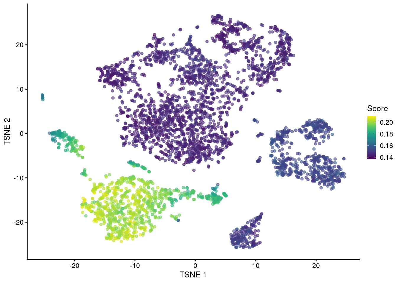
Figure 7.8: \(t\)-SNE plot of the cells in the PBMC dataset, colored by the activity of the GOBP_BIOLOGICAL_PROCESS_INVOLVED_IN_INTERSPECIES_INTERACTION_BETWEEN_ORGANISMS gene set.
Note that many Bioconductor packages implement methods for quantifying gene set enrichment, e.g., fgsea, goseq, limma, to name a few. We like the hypergeometric test as it is simple and focuses on the top markers, but any function can be used as long as it can accept a ranking of genes. In all cases, we would recommend only using the enrichment \(p\)-values to rank the gene sets, not to make any statements about statistical significance. Many of these methods compute their \(p\)-values by assuming that genes are independent under the null hypothesis. In a biological system with highly coordinated pathways and processes, this is unlikely to be true, potentially inflating the type I error beyond the threshold for significance.
Session information
sessionInfo()## R Under development (unstable) (2025-12-24 r89227)
## Platform: x86_64-pc-linux-gnu
## Running under: Ubuntu 22.04.5 LTS
##
## Matrix products: default
## BLAS: /home/luna/Software/R/trunk/lib/libRblas.so
## LAPACK: /home/luna/Software/R/trunk/lib/libRlapack.so; LAPACK version 3.12.1
##
## locale:
## [1] LC_CTYPE=en_US.UTF-8 LC_NUMERIC=C
## [3] LC_TIME=en_US.UTF-8 LC_COLLATE=en_US.UTF-8
## [5] LC_MONETARY=en_US.UTF-8 LC_MESSAGES=en_US.UTF-8
## [7] LC_PAPER=en_US.UTF-8 LC_NAME=C
## [9] LC_ADDRESS=C LC_TELEPHONE=C
## [11] LC_MEASUREMENT=en_US.UTF-8 LC_IDENTIFICATION=C
##
## time zone: Australia/Sydney
## tzcode source: system (glibc)
##
## attached base packages:
## [1] stats4 stats graphics grDevices utils datasets methods
## [8] base
##
## other attached packages:
## [1] msigdbr_25.1.1 ensembldb_2.35.0
## [3] AnnotationFilter_1.35.0 GenomicFeatures_1.63.1
## [5] AnnotationDbi_1.73.0 scRNAseq_2.25.0
## [7] scater_1.39.1 ggplot2_4.0.1
## [9] scuttle_1.21.0 scrapper_1.5.10
## [11] DropletUtils_1.31.0 SingleCellExperiment_1.33.0
## [13] SummarizedExperiment_1.41.0 Biobase_2.71.0
## [15] GenomicRanges_1.63.1 Seqinfo_1.1.0
## [17] IRanges_2.45.0 S4Vectors_0.49.0
## [19] BiocGenerics_0.57.0 generics_0.1.4
## [21] MatrixGenerics_1.23.0 matrixStats_1.5.0
## [23] DropletTestFiles_1.21.0 BiocStyle_2.39.0
##
## loaded via a namespace (and not attached):
## [1] RColorBrewer_1.1-3 jsonlite_2.0.0
## [3] magrittr_2.0.4 gypsum_1.7.0
## [5] ggbeeswarm_0.7.3 farver_2.1.2
## [7] rmarkdown_2.30 BiocIO_1.21.0
## [9] vctrs_0.6.5 memoise_2.0.1
## [11] Rsamtools_2.27.0 DelayedMatrixStats_1.33.0
## [13] RCurl_1.98-1.17 htmltools_0.5.9
## [15] S4Arrays_1.11.1 AnnotationHub_4.1.0
## [17] curl_7.0.0 BiocNeighbors_2.5.0
## [19] Rhdf5lib_1.33.0 SparseArray_1.11.10
## [21] rhdf5_2.55.12 alabaster.base_1.11.1
## [23] sass_0.4.10 bslib_0.9.0
## [25] alabaster.sce_1.11.0 httr2_1.2.2
## [27] cachem_1.1.0 GenomicAlignments_1.47.0
## [29] lifecycle_1.0.5 pkgconfig_2.0.3
## [31] rsvd_1.0.5 Matrix_1.7-4
## [33] R6_2.6.1 fastmap_1.2.0
## [35] digest_0.6.39 dqrng_0.4.1
## [37] irlba_2.3.5.1 ExperimentHub_3.1.0
## [39] RSQLite_2.4.5 beachmat_2.27.1
## [41] filelock_1.0.3 labeling_0.4.3
## [43] httr_1.4.7 abind_1.4-8
## [45] compiler_4.6.0 bit64_4.6.0-1
## [47] withr_3.0.2 S7_0.2.1
## [49] BiocParallel_1.45.0 viridis_0.6.5
## [51] DBI_1.2.3 alabaster.ranges_1.11.0
## [53] alabaster.schemas_1.11.0 HDF5Array_1.39.0
## [55] R.utils_2.13.0 rappdirs_0.3.3
## [57] DelayedArray_0.37.0 rjson_0.2.23
## [59] tools_4.6.0 vipor_0.4.7
## [61] otel_0.2.0 beeswarm_0.4.0
## [63] R.oo_1.27.1 glue_1.8.0
## [65] h5mread_1.3.1 restfulr_0.0.16
## [67] rhdf5filters_1.23.3 grid_4.6.0
## [69] gtable_0.3.6 R.methodsS3_1.8.2
## [71] BiocSingular_1.27.1 ScaledMatrix_1.19.0
## [73] XVector_0.51.0 ggrepel_0.9.6
## [75] BiocVersion_3.23.1 pillar_1.11.1
## [77] babelgene_22.9 limma_3.67.0
## [79] dplyr_1.1.4 BiocFileCache_3.1.0
## [81] lattice_0.22-7 rtracklayer_1.71.3
## [83] bit_4.6.0 tidyselect_1.2.1
## [85] locfit_1.5-9.12 Biostrings_2.79.4
## [87] knitr_1.51 gridExtra_2.3
## [89] bookdown_0.46 ProtGenerics_1.43.0
## [91] edgeR_4.9.2 xfun_0.55
## [93] statmod_1.5.1 pheatmap_1.0.13
## [95] UCSC.utils_1.7.1 lazyeval_0.2.2
## [97] yaml_2.3.12 cigarillo_1.1.0
## [99] evaluate_1.0.5 codetools_0.2-20
## [101] tibble_3.3.0 alabaster.matrix_1.11.0
## [103] BiocManager_1.30.27 cli_3.6.5
## [105] jquerylib_0.1.4 GenomeInfoDb_1.47.2
## [107] dichromat_2.0-0.1 Rcpp_1.1.1
## [109] dbplyr_2.5.1 png_0.1-8
## [111] XML_3.99-0.20 parallel_4.6.0
## [113] assertthat_0.2.1 blob_1.2.4
## [115] sparseMatrixStats_1.23.0 bitops_1.0-9
## [117] alabaster.se_1.11.0 viridisLite_0.4.2
## [119] scales_1.4.0 purrr_1.2.1
## [121] crayon_1.5.3 rlang_1.1.7
## [123] cowplot_1.2.0 KEGGREST_1.51.1References
Ashburner, M., C. A. Ball, J. A. Blake, D. Botstein, H. Butler, J. M. Cherry, A. P. Davis, et al. 2000. “Gene ontology: tool for the unification of biology.” Nat. Genet. 25 (1): 25–29.
Bueno, R., E. W. Stawiski, L. D. Goldstein, S. Durinck, A. De Rienzo, Z. Modrusan, F. Gnad, et al. 2016. “Comprehensive genomic analysis of malignant pleural mesothelioma identifies recurrent mutations, gene fusions and splicing alterations.” Nat. Genet. 48 (4): 407–16.
Lun, A. T. L., F. J. Calero-Nieto, L. Haim-Vilmovsky, B. Gottgens, and J. C. Marioni. 2017. “Assessing the reliability of spike-in normalization for analyses of single-cell RNA sequencing data.” Genome Res. 27 (11): 1795–1806.
Lun, A. T. L., and J. C. Marioni. 2017. “Overcoming confounding plate effects in differential expression analyses of single-cell RNA-seq data.” Biostatistics 18 (3): 451–64.
McCarthy, D. J., and G. K. Smyth. 2009. “Testing significance relative to a fold-change threshold is a TREAT.” Bioinformatics 25 (6): 765–71.
Zheng, G. X., J. M. Terry, P. Belgrader, P. Ryvkin, Z. W. Bent, R. Wilson, S. B. Ziraldo, et al. 2017. “Massively parallel digital transcriptional profiling of single cells.” Nat. Commun. 8 (January): 14049.
As of time of writing, the top genes were LYZ, S100A8 and MNDA, suggesting that this cluster contains monocytes. But I’m not an immunologist, so take that with a grain of salt.↩︎
scRNA-seq experiments aren’t exactly cheap, either, so we should have some idea about what we’re putting into the sequencer.↩︎
Back in my day, a “dot plot” referred to a visualization of a pairwise sequence alignment. Bet most of you young’uns don’t know about that.↩︎
For starters, an \(X\)-fold change to the area of the bubble is only a \(\sqrt{X}\)-change to the radius, which requires more mental arithmetic when comparing adjacent bubbles. Also, if a bubble is too small, we can’t see its contents clearly, effectively discarding the data encoded by its color. It gets even worse for certain configurations of the bubble plot where the color represents the mean of the non-zero expression values; here, we need to mentally integrate the color of each bubble by its area to get the mean expression for comparisons between clusters.↩︎