Chapter 5 Visualization
5.1 Motivation
One of the major aims of scRNA-seq data analysis is to generate a pretty figure that visualizes the distribution of cells12. This is not straightforward as our data contains too many dimensions, even after PCA (Chapter 4). We can’t just create FACS-style biaxial plots of each gene/PC against another as there would be too many plots to examine. Instead, we use more aggressive dimensionality reduction methods that can represent our population structure in a two-dimensional embedding. The idea is to facilitate interpretation of the data by creating a visual “map” of its heterogeneity, where similar cells are placed next to each other in the embedding while dissimilar cells are further apart.
5.2 \(t\)-stochastic neighbor embedding
Historically, scRNA-seq data analyses were synonymous with \(t\)-stochastic neighbor embedding (\(t\)-SNE) (Van der Maaten and Hinton 2008). This method attempts to find a low-dimensional representation of the data that preserves the relationships between each point and its neighbors in the high-dimensional space. Unlike PCA, \(t\)-SNE is not restricted to linear transformations, nor is it obliged to accurately represent distances between distant populations. This means that it has much more freedom in how it arranges cells in low-dimensional space, enabling it to separate many distinct clusters in a complex population. To demonstrate, let’s pull out the Zeisel et al. (2015) dataset again:
library(scRNAseq)
sce.zeisel <- ZeiselBrainData()
is.mito.zeisel <- rowData(sce.zeisel)$featureType=="mito"

# Performing some QC to set up the dataset prior to normalization.
library(scrapper)
sce.qc.zeisel <- quickRnaQc.se(sce.zeisel, subsets=list(MT=is.mito.zeisel), altexp.proportions="ERCC")
sce.qc.zeisel <- sce.qc.zeisel[,sce.qc.zeisel$keep]

# Computing log-normalized expression values.
sce.norm.zeisel <- normalizeRnaCounts.se(sce.qc.zeisel, size.factors=sce.qc.zeisel$sum)

# Computing the variances and choosing top HVGs.
sce.var.zeisel <- chooseRnaHvgs.se(
    sce.norm.zeisel,
    more.var.args=list(use.min.width=TRUE),
    more.choose.args=list(top=2000)
)

# Performing the PCA.
sce.pcs.zeisel <- runPca.se(sce.var.zeisel, features=rowData(sce.var.zeisel)$hvg, number=25)
We compute the \(t\)-SNE from the PC scores to take advantage of the data compaction and noise removal of the PCA. Specifically, we calculate distances in the PC space13 to identify the nearest neighbors for each cell, which are then used for \(t\)-SNE layout optimization. This yields a 2-dimensional embedding in which neighboring cells have similar expression profiles. In Figure 5.1, we see that cells organize into distinct subpopulations corresponding to their cell types.
library(scater)
sce.tsne.zeisel <- runTsne.se(sce.pcs.zeisel)
plotReducedDim(sce.tsne.zeisel, dimred="TSNE", colour_by="level1class")
Figure 5.1: \(t\)-SNE plot constructed from the top PCs in the Zeisel brain dataset. Each point represents a cell, colored according to the authors’ published annotation.
As with everything in scRNA-seq, \(t\)-SNE is sensitive to a variety of different parameter choices (discussed here in some depth). One obvious parameter is the random seed used to initialize the coordinates for each cell in the two-dimensional space. Changing the seed will yield a different embedding (Figure 5.2), though they usually have enough qualitative similarities that the interpretation of the plot is unaffected.
sce.tsne.seed.zeisel <- runTsne.se(sce.pcs.zeisel, more.tsne.args=list(seed=123456))
plotReducedDim(sce.tsne.seed.zeisel, dimred="TSNE", colour_by="level1class")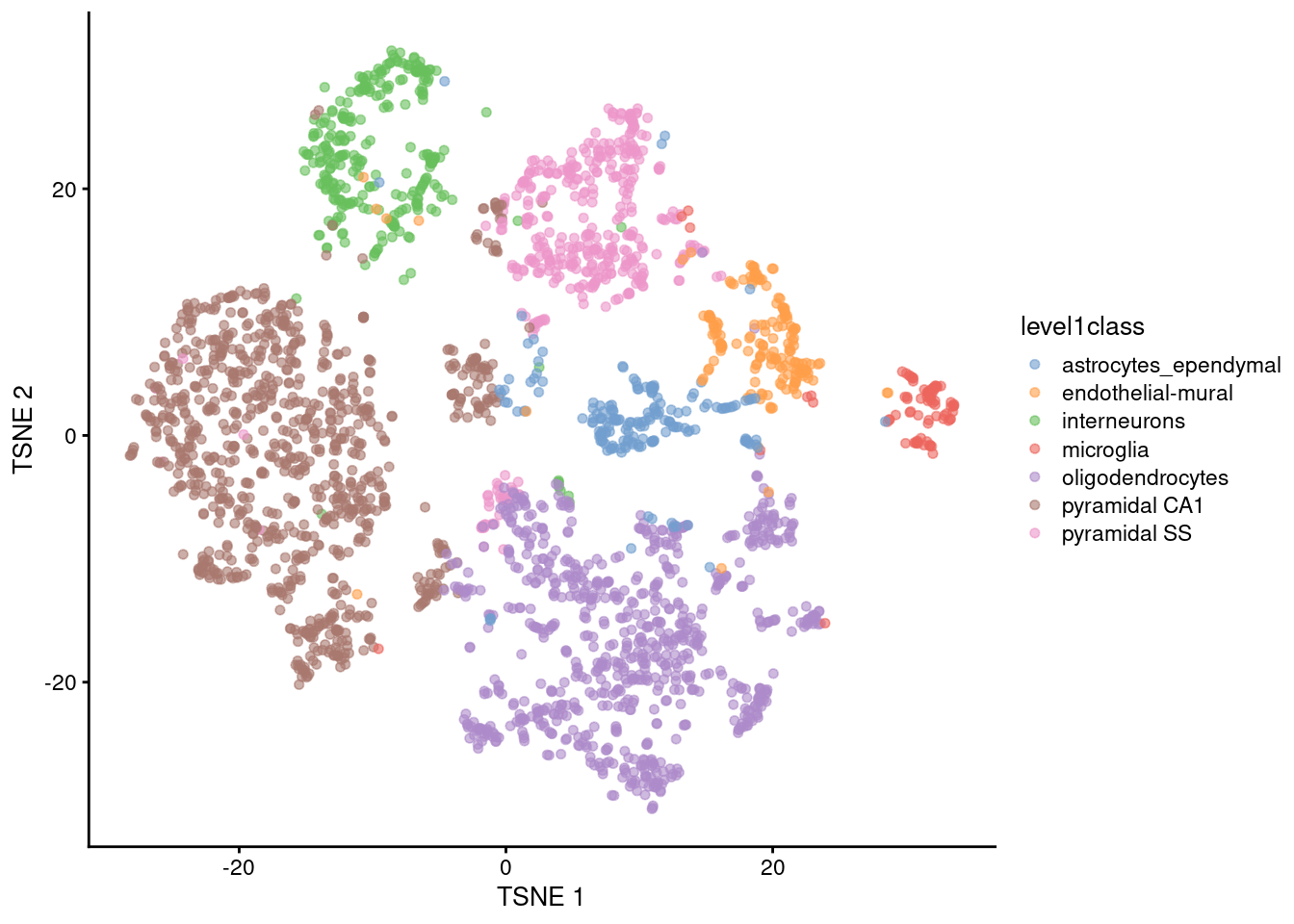
Figure 5.2: \(t\)-SNE plot constructed from the top PCs in the Zeisel brain dataset with a different seed. Each point represents a cell, colored according to the authors’ published annotation.
The perplexity is another important parameter that determines the granularity of the visualization. Low perplexities will favor resolution of finer structure while higher values focus on the broad organization of subpopulations. We can test different perplexity values to obtain different perspectives of the data (Figure 5.3), depending on whether we are interested in local or global structure.
sce.tsne.p5.zeisel <- runTsne.se(sce.pcs.zeisel, perplexity=5)
sce.tsne.p50.zeisel <- runTsne.se(sce.pcs.zeisel, perplexity=50)

gridExtra::grid.arrange(
    plotReducedDim(sce.tsne.p5.zeisel, dimred="TSNE", colour_by="level1class") + ggtitle("perplexity = 5"),
    plotReducedDim(sce.tsne.p50.zeisel, dimred="TSNE", colour_by="level1class") + ggtitle("perplexity = 50"),
    ncol=2
)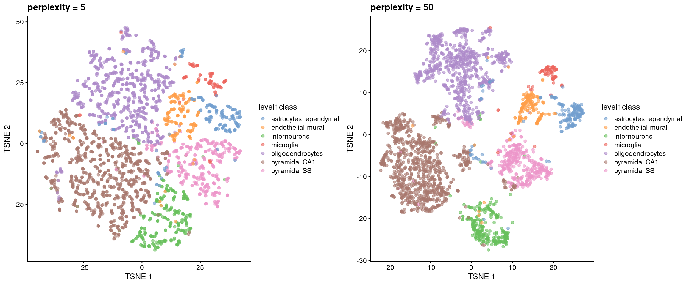
Figure 5.3: \(t\)-SNE plots constructed from the top PCs in the Zeisel brain dataset, using a range of perplexity values. Each point represents a cell, coloured according to its annotation.
We’d recommend interpreting these \(t\)-SNE plots with a grain of salt. \(t\)-SNE will inflate dense clusters and compress sparse ones, so we cannot use the relative size on the plot as a measure of subpopulation heterogeneity. The algorithm is not obliged to preserve the relative locations of non-neighboring clusters, so we cannot use their positions to determine relationships between distant clusters. Many liberties were taken with the data in order to squish it into a two-dimensional representation, so it’s worth being skeptical of the fidelity of that representation. That said, the \(t\)-SNE plots are pretty and historically popular so get used to seeing them14.
5.2.1 Uniform manifold approximation and projection
These days, \(t\)-SNE has largely been supplanted in the community’s consciousness by uniform manifold approximation and projection (UMAP) (McInnes and Healy 2018). UMAP is roughly similar to \(t\)-SNE in that it also tries to find a low-dimensional representation that preserves relationships between neighbors in high-dimensional space. However, the two methods are based on different theoretical principles that manifest as different visualizations. Compared to \(t\)-SNE, UMAP tends to produce more compact visual clusters with more empty space between them. We demonstrate on the Zeisel dataset where the UMAP is calculated on nearest neighbors identified from the PCs (Figure 5.4).
sce.umap.zeisel <- runUmap.se(sce.pcs.zeisel)
plotReducedDim(sce.umap.zeisel, dimred="UMAP", colour_by="level1class")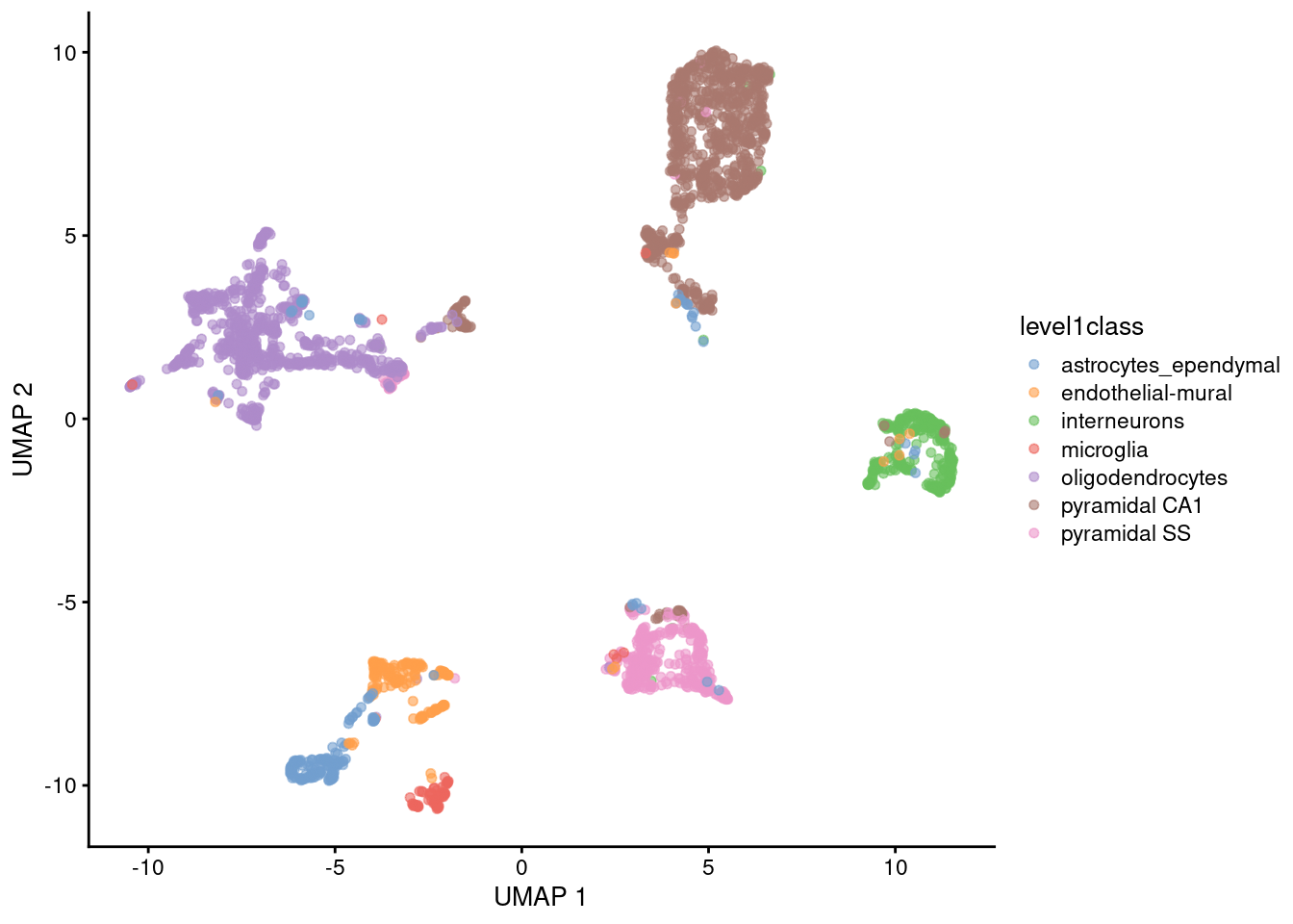
Figure 5.4: UMAP plot constructed from the top PCs in the Zeisel brain dataset. Each point represents a cell, coloured according to the published annotation.
Like \(t\)-SNE, UMAP has its own suite of parameters that affect the visualization (see the documentation here). The number of neighbors is most analogous to \(t\)-SNE’s perplexity, where lower values focus on the local structure around each cell (Figure 5.5).
sce.umap.n3.zeisel <- runUmap.se(sce.pcs.zeisel, num.neighbors=3)
sce.umap.n30.zeisel <- runUmap.se(sce.pcs.zeisel, num.neighbors=30)

gridExtra::grid.arrange(
    plotReducedDim(sce.umap.n3.zeisel, dimred="UMAP", colour_by="level1class") + ggtitle("neighbors = 3"),
    plotReducedDim(sce.umap.n30.zeisel, dimred="UMAP", colour_by="level1class") + ggtitle("neighbors = 30"),
    ncol=2
)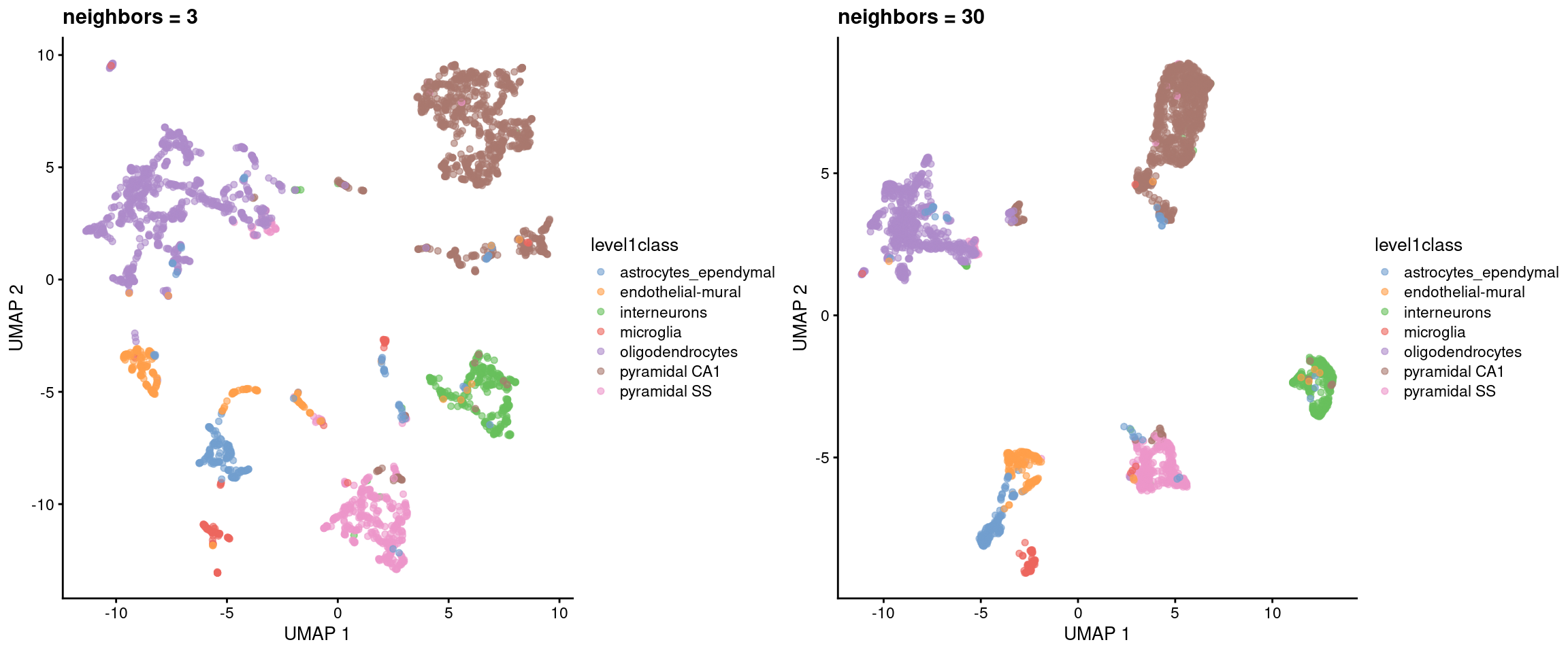
Figure 5.5: UMAP plots constructed from the top PCs in the Zeisel brain dataset, using a range of neighbors. Each point represents a cell, coloured according to its annotation.
Another influential parameter is the minimum distance between points in the embedding. Larger values will generally inflate the visual clusters and reduce the amount of whitespace in the plot (Figure 5.6). Sometimes it’s worth fiddling around with some of these parameters to get a prettier plot.
sce.umap.d01.zeisel <- runUmap.se(sce.pcs.zeisel, min.dist=0.01)
sce.umap.d5.zeisel <- runUmap.se(sce.pcs.zeisel, min.dist=0.5)

gridExtra::grid.arrange(
    plotReducedDim(sce.umap.d01.zeisel, dimred="UMAP", colour_by="level1class") + ggtitle("mindist = 0.01"),
    plotReducedDim(sce.umap.d5.zeisel, dimred="UMAP", colour_by="level1class") + ggtitle("mindist = 0.5"),
    ncol=2
)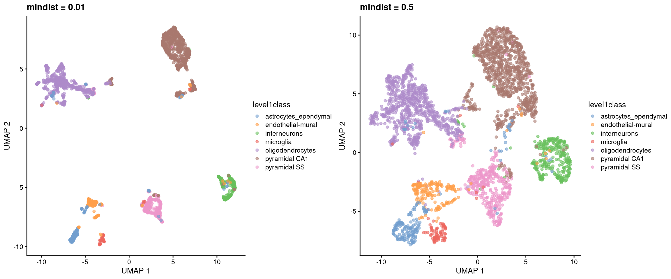
Figure 5.6: UMAP plots constructed from the top PCs in the Zeisel brain dataset, using a range of minimum distances. Each point represents a cell, coloured according to its annotation.
The choice between UMAP or \(t\)-SNE is mostly down to personal preference. It seems that most people find the UMAP to be nicer to look at, possibly because of the cleaner separation between clusters. UMAP also has an advantage in that its default initialization (derived from the nearest-neighbors graph) is better at capturing the global structure (Kobak and Linderman 2021); however, this is not applicable when distant subpopulations are completely disconnected in the graph. From a practical perspective, UMAP is often faster than \(t\)-SNE, which is an important consideration for large datasets. In any case, much of the same skepticism that we expressed for \(t\)-SNE is still applicable to UMAP, as a great deal of information is lost when flattening the data into two dimensions.
If we can’t decide between a UMAP and a \(t\)-SNE, we can just compute them both15 via the runAllNeighborSteps.se() function.
This runs both functions in parallel, along with the graph-based clustering described in Chapter 6.
It also optimizes the nearest neighbor search by performing it once and re-using the results across multiple graph-related functions.
sce.nn.zeisel <- runAllNeighborSteps.se(sce.pcs.zeisel)
reducedDimNames(sce.nn.zeisel)
## [1] "PCA" "TSNE" "UMAP"5.3 More comments on interpretation
All of these visualizations necessarily distort the relationships between cells to fit high-dimensional data into a 2-dimensional space. It’s fair to question whether the results of such distortions can be trusted. As a general rule, focusing on local neighborhoods provides the safest interpretation of \(t\)-SNE and UMAP plots. These methods spend considerable effort to ensure that each cell’s nearest neighbors in the input high-dimensional space are still its neighbors in the output two-dimensional embedding. Thus, if we see multiple cell types or clusters in a single unbroken “island” in the embedding, we could infer that those populations were also close neighbors in higher-dimensional space.
Less can be said about non-neighboring cells/clusters as there is no guarantee that large distances are faithfully recapitulated in the embedding. We can conclude that cells in distinct visual clusters are indeed different, but comparing distances between clusters is usually pointless16. As a thought exercise, imagine a dataset with 4 cell types arranged in three-dimensional space as a regular tetrahedron17. All cell types are equally distant from each other, but it is impossible to preserve this property in a two-dimensional embedding. This can lead to some incorrect conclusions about the relative (dis)similarity of the different cell types if we are not careful with our interpretation of the plot.
Personally, we only use the \(t\)-SNE/UMAP coordinates for visualization. Other steps like clustering still use the higher-rank representation (i.e., the PCs) to leverage all of the information in the data without any of the compromises required to obtain a two-dimensional embedding. In theory, we could use the \(t\)-SNE/UMAP coordinates directly for clustering to ensure that any results are directly consistent with the visualization18. We don’t do this as we don’t want our analysis results to change whenever we tweak the parameters to beautify our visualizations.
5.4 Other visualization methods
Here’s a non-exhaustive list of other visualization methods in R/Bioconductor packages:
- Interpolation-based \(t\)-SNE (Linderman et al. 2019) from the snifter package.
- Density-preserving \(t\)-SNE and UMAP (Narayan, Berger, and Cho 2021) from the densvis package.
All of these packages will happily accept a matrix of PC scores and are plug-and-play replacements for runTsne.se() and runUmap.se().
Session information
sessionInfo()## R Under development (unstable) (2025-12-24 r89227)
## Platform: x86_64-pc-linux-gnu
## Running under: Ubuntu 22.04.5 LTS
##
## Matrix products: default
## BLAS: /home/luna/Software/R/trunk/lib/libRblas.so
## LAPACK: /home/luna/Software/R/trunk/lib/libRlapack.so; LAPACK version 3.12.1
##
## locale:
## [1] LC_CTYPE=en_US.UTF-8 LC_NUMERIC=C
## [3] LC_TIME=en_US.UTF-8 LC_COLLATE=en_US.UTF-8
## [5] LC_MONETARY=en_US.UTF-8 LC_MESSAGES=en_US.UTF-8
## [7] LC_PAPER=en_US.UTF-8 LC_NAME=C
## [9] LC_ADDRESS=C LC_TELEPHONE=C
## [11] LC_MEASUREMENT=en_US.UTF-8 LC_IDENTIFICATION=C
##
## time zone: Australia/Sydney
## tzcode source: system (glibc)
##
## attached base packages:
## [1] stats4 stats graphics grDevices utils datasets methods
## [8] base
##
## other attached packages:
## [1] scater_1.39.1 ggplot2_4.0.1
## [3] scuttle_1.21.0 scrapper_1.5.10
## [5] scRNAseq_2.25.0 SingleCellExperiment_1.33.0
## [7] SummarizedExperiment_1.41.0 Biobase_2.71.0
## [9] GenomicRanges_1.63.1 Seqinfo_1.1.0
## [11] IRanges_2.45.0 S4Vectors_0.49.0
## [13] BiocGenerics_0.57.0 generics_0.1.4
## [15] MatrixGenerics_1.23.0 matrixStats_1.5.0
## [17] BiocStyle_2.39.0
##
## loaded via a namespace (and not attached):
## [1] RColorBrewer_1.1-3 jsonlite_2.0.0 magrittr_2.0.4
## [4] ggbeeswarm_0.7.3 GenomicFeatures_1.63.1 gypsum_1.7.0
## [7] farver_2.1.2 rmarkdown_2.30 BiocIO_1.21.0
## [10] vctrs_0.6.5 memoise_2.0.1 Rsamtools_2.27.0
## [13] RCurl_1.98-1.17 htmltools_0.5.9 S4Arrays_1.11.1
## [16] AnnotationHub_4.1.0 curl_7.0.0 BiocNeighbors_2.5.0
## [19] Rhdf5lib_1.33.0 SparseArray_1.11.10 rhdf5_2.55.12
## [22] sass_0.4.10 alabaster.base_1.11.1 bslib_0.9.0
## [25] alabaster.sce_1.11.0 httr2_1.2.2 cachem_1.1.0
## [28] GenomicAlignments_1.47.0 lifecycle_1.0.5 pkgconfig_2.0.3
## [31] rsvd_1.0.5 Matrix_1.7-4 R6_2.6.1
## [34] fastmap_1.2.0 digest_0.6.39 AnnotationDbi_1.73.0
## [37] irlba_2.3.5.1 ExperimentHub_3.1.0 RSQLite_2.4.5
## [40] beachmat_2.27.1 labeling_0.4.3 filelock_1.0.3
## [43] httr_1.4.7 abind_1.4-8 compiler_4.6.0
## [46] bit64_4.6.0-1 withr_3.0.2 S7_0.2.1
## [49] BiocParallel_1.45.0 viridis_0.6.5 DBI_1.2.3
## [52] HDF5Array_1.39.0 alabaster.ranges_1.11.0 alabaster.schemas_1.11.0
## [55] rappdirs_0.3.3 DelayedArray_0.37.0 rjson_0.2.23
## [58] tools_4.6.0 vipor_0.4.7 otel_0.2.0
## [61] beeswarm_0.4.0 glue_1.8.0 h5mread_1.3.1
## [64] restfulr_0.0.16 rhdf5filters_1.23.3 grid_4.6.0
## [67] gtable_0.3.6 ensembldb_2.35.0 BiocSingular_1.27.1
## [70] ScaledMatrix_1.19.0 XVector_0.51.0 ggrepel_0.9.6
## [73] BiocVersion_3.23.1 pillar_1.11.1 dplyr_1.1.4
## [76] BiocFileCache_3.1.0 lattice_0.22-7 rtracklayer_1.71.3
## [79] bit_4.6.0 tidyselect_1.2.1 Biostrings_2.79.4
## [82] knitr_1.51 gridExtra_2.3 bookdown_0.46
## [85] ProtGenerics_1.43.0 xfun_0.55 UCSC.utils_1.7.1
## [88] lazyeval_0.2.2 yaml_2.3.12 evaluate_1.0.5
## [91] codetools_0.2-20 cigarillo_1.1.0 tibble_3.3.0
## [94] alabaster.matrix_1.11.0 BiocManager_1.30.27 cli_3.6.5
## [97] jquerylib_0.1.4 dichromat_2.0-0.1 Rcpp_1.1.1
## [100] GenomeInfoDb_1.47.2 dbplyr_2.5.1 png_0.1-8
## [103] XML_3.99-0.20 parallel_4.6.0 blob_1.2.4
## [106] AnnotationFilter_1.35.0 bitops_1.0-9 viridisLite_0.4.2
## [109] alabaster.se_1.11.0 scales_1.4.0 crayon_1.5.3
## [112] rlang_1.1.7 cowplot_1.2.0 KEGGREST_1.51.1References
Kobak, D., and G. C. Linderman. 2021. Nat. Biotechnol. 39 (2): 156–57.
Linderman, G. C., M. Rachh, J. G. Hoskins, S. Steinerberger, and Y. Kluger. 2019. “Fast interpolation-based t-SNE for improved visualization of single-cell RNA-seq data.” Nat. Methods 16 (3): 243–45.
McInnes, L., and J. Healy. 2018. “UMAP: Uniform Manifold Approximation and Projection for dimension reduction.” arXiv, February, 1802.03426.
Narayan, A., B. Berger, and H. Cho. 2021. “Assessing single-cell transcriptomic variability through density-preserving data visualization.” Nat. Biotechnol., 19.
Van der Maaten, L., and G. Hinton. 2008. “Visualizing data using t-SNE.” J. Mach. Learn. Res. 9: 2579–2605.
Zeisel, A., A. B. Munoz-Manchado, S. Codeluppi, P. Lonnerberg, G. La Manno, A. Jureus, S. Marques, et al. 2015. “Brain structure. Cell types in the mouse cortex and hippocampus revealed by single-cell RNA-seq.” Science 347 (6226): 1138–42.
A cynical person might say that this is the only aim of single-cell technologies, judging by a brief perusal of some recent manuscripts. But we would never be so pessimistic.↩︎
For the purposes of this chapter, the PC space is still “high-dimensional”. We started with extremely high-dimensional data in our expression matrix (tens of thousands of genes), got down to more regular high-dimensional data after PCA (tens of PCs), and are now trying to get to a low-dimensional embedding (2, or maybe even 3 dimensions) that our feeble human minds can comprehend.↩︎
Personally, we like \(t\)-SNE plots because they look a bit like histology slides, which can trick those who don’t know us into thinking that we’re a real biologist. This, in turn, helps us sneak into conferences where we can disseminate our MALAT1 propaganda on an unsuspecting audience.↩︎
¿Por qué no los dos?↩︎
We’ve seen people do this with a ruler, to “prove” that one cell type is more closely related to another.↩︎
A triangular pyramid where all edges are the same length.↩︎
Clustering is rather arbitrary anyway, so there is nothing inherently wrong with this strategy. In fact, it can be treated as a rather circuitous implementation of graph-based clustering (Section 6.2).↩︎